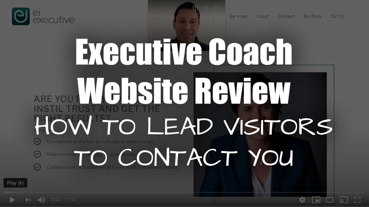
Executive Coaching Website Review – Tips to Lead Visitors Deeper Into Content and Then Contact You
In this video, I review Sheila’s executive coaching website and share things I love about it and ideas to enhance it. Sheila’s website is at eiexecutive.com.au
Click here to watch this website review on YouTube.
Many more website reviews over at CoachingSitesThatWork on YouTube.
As I create, review or enhance websites, I always keep this guiding question in mind, How can I make this website better for attracting clients?
I love her photos — professional, friendly, and warm. They make me feel connected right away. I also love the simple layout. It’s refreshing to know where the logo is, the menu is, and the content to start with. I feel safe and secure about getting around.
In the video, I go into these suggestions to improve it:
- Where and how to put your name on homepage
- Why remove the “cart” item from the menu
- Suggestions for clarity in your logo
- Tips for leading visitors deeper with an engaging story about what you do
- Something quirky to resolve in the footer
- Simplifying the main call to action to contact you
- How to use your book in your sales process
If you would like to book some quality time with me to review your website and get a quick video like this then book a website review now.

