The Coaching Website Guide – Version 4 is here!
UPDATE 11/28/2022 – I’ve finished edits, and The Coaching Website Guide V4 is now available on Gumroad as a PDF download here. The official sales page with details is here. Later this week, it will go from $129 to $150, and I will remove the 20% discount code 20guide20 — which you can still use now 😉
It’s a big PDF with my best stuff from 20 years online, helping coaches build their professional credibility online so they can confidently get out there and attract new clients.
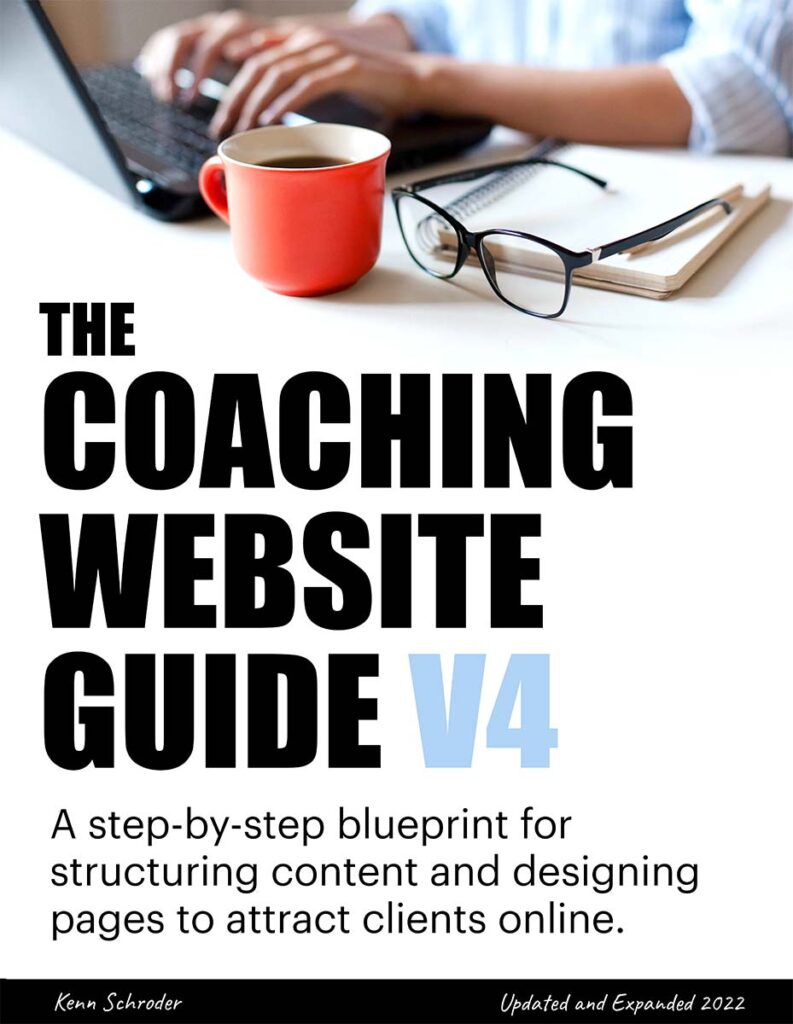
NEW COVER AND TAGLINE
Thanks to everyone for their feedback. I went with the suggestions from everyone but added more black to match this website. Here’s the cover.

KEY UPDATES
- Updated tagline to -> A step-by-step blueprint for creating content and designing pages to attract new clients online.
- Advice to settle in on your niche, brand, and voice. We’ll create a message that you can feel confident about.
- Stories, tips, and tools from 20 years as a web designer — helping coaches get online, build traffic, and find new clients.
- Updated examples with 6 websites I’ve created in the last few years.
- Reworked material about niches — to help you make decisions and move past confusion.
- Integrated brand archetypes for better visuals and to bring out your authentic voice.
- Add a new freebie approach — the glorious PDF.
- Reworked keyword research for faster content creation.
- Edited and added content about getting visible, especially ways to think yourself past fears of self-promotion and client followups (not exactly website design, but necessary for enrolling new clients.
Not only does a great website show that you’re a pro, but it gives you the confidence to get out there, knowing the right clients will be impressed.
Use this code this week …
Just use code 20guide20 at this link.


depending on your tribe
my first impression on the level of feeling is the right one, it attracts my emotional attention
intellectuals will choose the left one
Thanks for that, Yole.
I think the title being higher on the page grabs me more than the left version – where it is competing with the glasses and coffee cup. I find myself focusing on the orange coffee cup, not on your title.
I’ve been away from coaching for a bit and am just coming back to it. Your work is always insightful.
Thanks so much Melinda.
It’s a little odd lower and the cup is quite
a convo piece.
Welcome back to coaching!
Left!
Hi Kenn, I would prefer the first one. I like the colors and the image in the background. It looks professional and clean. Good luck with the launch 🙂
Like the left appears proessional
Great, thanks Henry!
The coffee cup definitely works 🙂
Thanks Tarique.
Definitely this one as the second one looks outdated.
Great, thanks Barbara!
Hello Kenn,
I know I am judgemental. I judge people by the country they live in. Usually, Americans are loud and brash, repeating themselves in long advertising copy. I’m one of those people who skip to the end to discover the price and then look for real reviews. Even so, I often buy stuff I never use. My pet beef is the use of coloured font on a coloured background. As I get older (I’m now Forever Young and Ageless) I find it difficult to read and distracting
You break all my preconceived ideas, I love your work and have one of your earlier editions which helped so much before I used professionals. Please keep up the great work you do. I love the simplicity you portray
Thanks for sharing that Elaine.
Hey there, I prefer the first one. It’s a cleaner image and more contemporary/classic. Good luck with the launch Kenn.
Thanks Louisa!
Thanks Adrianne!
I like elements of both! I like the clean look of the first one and the feeling I get of a woman creating her own website on her laptop, and I like the sense of happiness and freedom conveyed by the second one.
Thanks for chiming in Kristen!
From other feedback as well — there’s that energy in the right image that would be nice in the first image.
I keep searching for it. Oh the joy of perfection.
I prefer the one with white background without the coffee cup and glasses too crowded with your stuff cup glasses book hands computer what about a picture of you or of the guide. looking forward to receiving my updated copy
Cheers
Melissa
Thanks for chiming in Melissa!
Awesome! Any specific topics that would help you the most?
I found the original guide super useful as I created copy for my website. I’m sure this updated version will be even more valuable for coaches (like me) as they build their websites.
Thanks Louisa!
Looking forward to the new version, appreciate that its designed with coaches and their clients in mind (technology remains an ongoing challenge for me)
Cheers
Very welcome! Yep — for coaches and helping them think about their clients.
Let’s go Kenn! Finish the book so you can impact more coaches and the amazing people we serve!
Great!!!
Way to go Kenn.
Can’t wait to see the new stuff you will be sharing.
My new website is almost done.
Thanks Ron!
Yep, some new stuff on the way. I always keep my eye on design, content, anything-everything that’ll make websites better at attracting clients.
Early grats on almost getting launched.