Coaching Website Tweak for Heike
If you want me to review your coaching website schedule some quality time with me here and we’ll find high-impact yet easy-to-do enhancements to improve your website for client-attraction.
Below is a before and after for one website tweak to grow Heike’s list. Heike’s business coaching website is here.
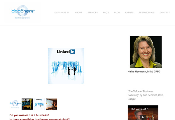
Here’s the before screenshot

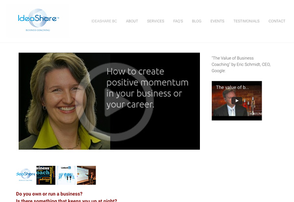
Here’s my suggested tweak
Great photo and smile Heike. That’s a big plus.
To improve …
The pages feels like an unfinished website or a very scattered one because the video is very white and small. It’s also confusing because it’s not really a video but sliding images that don’t make sense to me.
I find that Weebly sites get sloppy fast.
I strongly suggest a great headline at the top (my blog has heaps of examples in recent posts).
Also, if you are going to do a video, make it you – the expert, the human, the caring, warm coach they should hire. Avoid stuff like “Ideashare coaching will help you yatta yatta yatta”.
Here’s the after screenshot

I’d love to hear your thoughts, just post below.


The before was difficult to understand. I had no idea where to place my focus. The after image gives my eye focus with a much clearer description of the purpose and intent.
Before was like looking at a photo of her on a white piece of paper in a binder….
After was waiting for a very confident woman to start speaking to me about powering up my life … And I was anxious to listen?