Before and After for Jeannie
Here’s a website before and after for Jeannie Murphy at http://www.ForTimesLikeThis.com.
If you want your website looked at to improve it, just schedule some quality time with me here, and we’ll find high-impact yet easy-to-do enhancements to improve your website for client attraction.
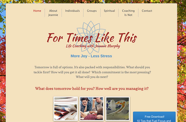
Here’s the BEFORE
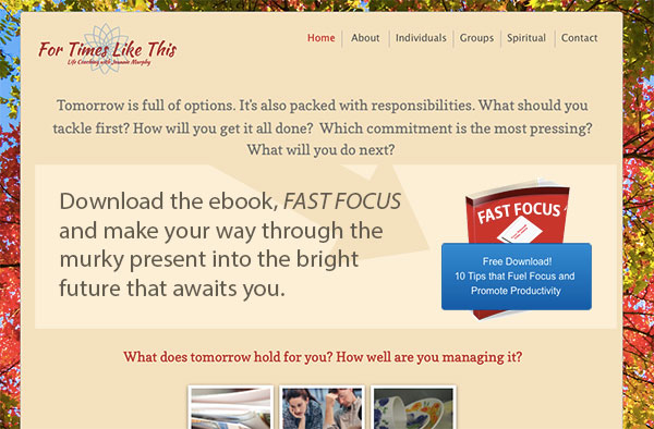
Here’s my suggested tweak
I’d get your free giveaway up to the top of your website for two BIG marketing reasons:
(1) Because it will be a tool to drive traffic to your site. Imagine networking live, or chatting online, when you interact, you can tell people, “Hey, get 10 tips to fuel focus and promote productivity at my website.” It’s much better than saying, “Hey, check out my site,” which no one ever does.
… and …
(2) Because it’s a tool to grow your list via ethical bribe. They get the freebie by joining your list – and of course, they can easily jump off your list when you want. It’s like getting a free topping with your pizza. It’s a way to get people in the door and give them a taste. Attract.
And don’t be like, “Is he really comparing coaching to pizza? 😉
Here’s the after
Also, by having people on our list, you gain control and can actively grow the relationship as you send them emails. If you don’t get them on your list, you may never interact with that visitor again. Boo.
Love to hear what you think. I read all comments and will respond. Just post below.
IMO, making the freebie the focal point in the “after” version not only gives the site more of a purpose, but is also looks more appealing. Not sure if it’s the smaller logo, the graphics for the freebie or a combination.
I’m more likely to subscribe to her list in the new version with the graphic and headline prominently at the top of the page, than I am in the original version (where the button can be easily scrolled past and go unnoticed).
I also like the arrow pointing to the report graphic which naturally draws the eye to click the blue button.
Love your first point on giving people a reason to go to your website…makes perfect sense.
Hey Jack, thanks for sharing your thoughts.
I see how the logo being the focal point does not help grab a visitor’s attention. Placing the invitation to download the ebook is a much better attention grabber.
Yep … the hard thing is as the owners of our websites, WE want what WE want … like big logos, and flashy images.
But visitors what to get value – like help overcoming their challenges.
A prominent freebie with good info is one great way to give support.
Thanks for chiming in Charlotte.