
Website Client-Attraction Tip for Jem
To improve Jem Friar’s personal detox coaching website for client attraction, here are before and after images along with my suggested tweak.
Want me to review your website? Just schedule some quality time with me here and we’ll find high-impact yet easy-to-do enhancements to improve your website for client-attraction.
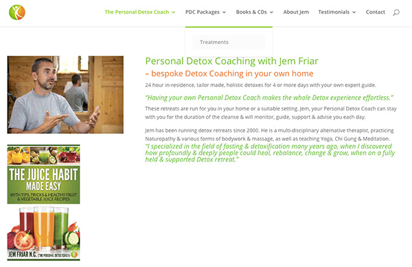
Before screenshot
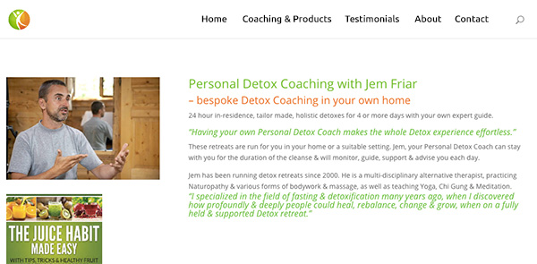
My suggested tweak for attracting more clients to your website
I like the location of the menu at the top. Easy to find and not too big. I also like your URL, says what you do. Good!
But, I don’t like the wording or organization of that menu. I expect users will struggle to find content because of the drop down menus. In general, I hate drop down menus for coaching websites. It’s almost unnecessary. I’d avoid them.
The problem is that many people who roll over the menus will not realize that the rollover top item is actually clickable and they won’t click that. They’ll assume the drop down is what they should click next. Thus, your packages and books and cds won’t get seen.
I’d either add the “packages” and “Books&CDs” to the submenu to be redundant and ensure people see it, or just get rid of the drop downs.
To explain this better, I made a quick video, click this to see this video.
Here’s the after screenshot
What do you think? Like the suggestion? Have ideas to make it even better? I’d love to hear from you. Just comment below.
Great feedback Kenn. I appreciate your insight & your suggestion – I will modify the drop down menus.
Thanks for taking the time to look at it & to video your feedback too 🙂
p.s. I like your site & am just starting to explore all of the great information that you have shared here – awesome job!
Great .. hope you find handy stuff Jem. Thanks for sharing your site and I hope for great things in your biz.
I reckon the 3 pics are better but upside down. I’d have the juices in glass on top then the juice habit made easy then his photo on bottom. To me it is then symmetrical.
I don’t like all the different colour print.
Good points as well.
The glasses are part of the cover of the juice habit made easy book.
Point taken about the different font colors though Bill 🙂