Website Review for Joyce
To improve Joyce Glick‘s coaching website for client attraction, here are before and after images along with my suggested tweak.
Want me to review your website? Just follow this link and schedule some quality time with me and we’ll find high-impact yet easy-to-do enhancements to improve your website for client-attraction.
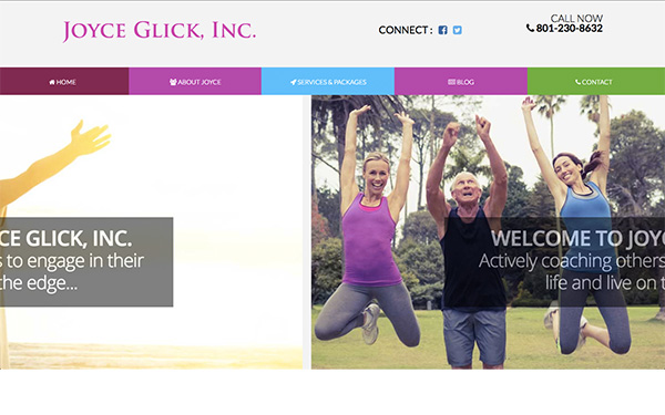
Before screenshot

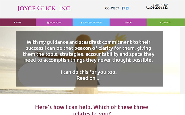
My suggested tweak for attracting more clients with your website
I love the short url, nice. Also the modern layout is nice and it looks like it works well for mobile device. Good.
My pet peeve: sliders. I hate them unless they’re edible a plate (mini burgers).
By sliders, I mean sliding images/content on the home page.
What you don’t want to do is take control away from visitors OR force-feed them content. And sliders do both. They often go to fast or too slow, have missing or clumsy controllers, and don’t add anything useful. Dump them.
Don’t get me wrong, a great image helps deliver your message, but sliding them around almost never works.
Better, I suggest a WOW message so they say, “I gotta engage with this site” and let them learn more, sign up for a list, enroll or other action.
Here’s the after screenshot

Does this spark any reactions, thoughts, ideas or suggestions? Let’s hear it! Post below. 😉


I am reading this as a potential client, therefore I need to see some reference to the word clients…example:
With my guidance and steadfast commitment to my clients success…the rest unchanged and it now makes sense to me.
Good catch there Bill. Thanks.