Website Client-Attraction Tip for Karen
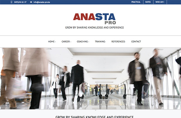
To improve Karen Van den Broeck’s coaching website for client attraction, here are before and after images along with my suggested tweak.
Want me to review your website? Just follow this link and schedule some quality time with me and we’ll find high-impact yet easy-to-do enhancements to improve your website for client-attraction.
Before screenshot

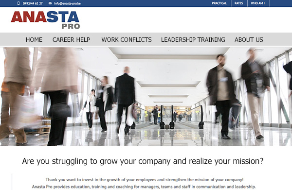
My suggested tweak for attracting more clients to your website
You go to the auto shop with your broken car and he says to you, “Do you want engine help, transmission help, or electrical help?” – and you go cross-eyed.
That’s because clients want help with their challenges (problems) and will be drawn to those who can overcome (solve) them.
When your website says you offer technical solutions like “Coaching, Training, or Consulting” you make clients go cross-eyed. Instead, offer challenge-based solutions like “Find dream career, Find higher-pay job, Start a business.”
So for your site, I’d start with a menu tweak and change it up to be more challenge focused. Here’s what I mean …
Here’s the after screenshot

What do you think? Like the suggestion? Have ideas to make it even better? I’d love to hear from you. Just comment below.

