Kick-Ass Cover Tip 3 With Video
In the last two posts, I shared two tips with you: (1) make your title super easy to read and (2) find one good image to support the title. Today, we go into the last kick-ass tip – a sweet, simple layout. And you can follow along in the video below to create your own freebie cover design.
A quick note before we begin … on Tuesday this week, you can enroll in the great website course and get your client-attracting coaching website up fast. You’ll get content, design, and technical steps you can do in your spare time. It might be just what you need now. Have a look.
Now, on to my simple approach to a great cover …
Here’s what I do:
- Use just one cool font for the title – the one that matches my website.
- Use just one good image that supports the title.
- Sample a darker color from the image for the cover background.
- Make the title white or a lighter color so it stands out over the dark background.
I avoid …
- using multiple images as it becomes confusing
- using multiple fonts because it gets ugly
- using too many colors because it causes clashing
- trying to find the perfect image because it frustrates me and wastes time
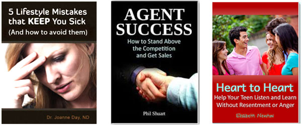
Can you see how each of the points above works in these examples?

I especially like using a solid color for the background of the image because it creates a very powerful feeling AND when placed on a web page, it stands out.
As you can see the agent success one is using a powerful black, and the heart-to-heart one is using a warm red.
Now it’s your turn. Watch this video to create your own kick-ass freebie cover.
Before you do the video, have a title in mind for your freebie and find an image for it at BigStockPhoto.com.
In the video, I refer to an example website, CoachKenn.com, that I use in the course.
We’ll be using Pixlr, a free online graphic design tool like Photoshop.
Be sure to click the full-screen button on the bottom right of the video.
In the coaching website course starting this week, you’ll get more videos like these along with all my trade secrets for building your website quickly with vital client-attraction functionality including your email list, blog, freebie, and more. Learn more about the course here.
How did that go? Did you create your cover? Love to hear from you, just post below.

