Kick-Ass Cover Tip 2
In the last post I talked about tip #1, make sure your title is very easy to read. If it isn’t easy to read, it won’t grab attention as well as it could.
Today we have tip #2, find a great image to support your title. When you find a good one, it will enhance your message and give your work that high-end, expert look.
Here are some things to keep in mind …
- One good image will do the trick, you don’t need more. More will just complicate matters and suck up time.
- Make sure the image supports the title without your reader having to think. You don’t want a complicated image that requires deep analysis to understand.
- Don’t spend days on trying to find the perfect image, just a good one that supports the title.
- If you have people in your image, be sure they are the ones in your market. Let’s say you work with parents in their 40s and 50s, then be sure your subjects look that age.
- You don’t need people in your photo, but if you have them, you’ll want to steer clear of the cheesy “smiling support person with a headset” type of image you’ve seen everywhere. Instead, go for images with feeling – like a woman spreading her arms to the sky in the woods feeling free, fresh and alive.
Here are some examples from the last post I made. Can you see how the images support the title?

Like?
There are a few websites to get images from but I highly recommend you head to BigStockPhoto and forget the rest. They have a wide selection at low-cost with rights to use them in your coaching business.
Ok, now that you get the idea of one good image that clearly relates to the title, here’s an example …
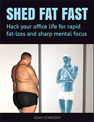
I’m creating a free giveaway for overweight office guys and the title is Shed Fat Fast: Hack Office Life for Rapid Weight-Loss and Sharp Mental Focus.
Any of these kinds of images will do:
- A smart-looking guy
- A guy with sparkling eyes
- A guy in a suit or biz casual wear
- A thin guy in a suit
- Anyone commuting fast
- People moving fast
- Office guy moving fast
Here are some terms I used to search for an appropriate image: run suit, abs suit, thin suit, suit man, man suit concept (using the word “concept” gets you more creative images), walk city, fat laptop, fat concept, thin concept, suit concept, lose weight man.
Here are some images I found with a quick search that would all do the trick:

I avoided the common “tape measure around the waist” type of Jenny Craig image or a picture of abs as I don’t want appear to be a fitness trainer.
So, I chose the fast-moving office people picture because of the officy, fast-paced feeling. Again, any of these four would work well.
Here’s the freebie cover I created from the fast walking people image. (By the way, in a two days when the next blog post comes out, you’ll see me in a video making this cover. You’ll also get to follow along and make one for yourself!)

Cool?
Do you see how the image supports the title? Feel good?
Remember, your photo doesn’t have to be perfect, and any of the above would have done the trick. Here’s a cover image with the heavy-set guy (and I like this image the least, but it works, actually quite well).

Great.
Thus far, the two cover design tips:
- Make the title very easy to read, from the last post.
- And today’s tip, choose an image that supports the title (don’t spend forever finding the perfect one).
The third tip for your kick-ass cover design will come in the next article in about two days. I’m also going to include a sweet video tutorial so you can see how things unfold, learn my simple layout trick and actually create your own cover.
That’s all for today.
What are you finding helpful in the article today? Got a question or comment? Just post it below. I’d love to hear from you (funny coach jokes are welcome as well 😉

