Website Client-Attraction Tip for Lara
To improve Lara Siegel’s executive coaching website for client-attraction, here are before-and-after images along with my suggested tweak.
If you want me to review your coaching website then schedule some quality time with me here and we’ll find high-impact yet easy-to-do enhancements to improve your website for client-attraction.
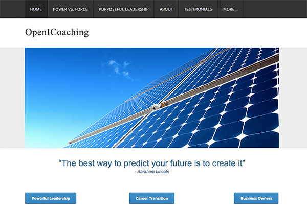
Here’s the before screenshot …

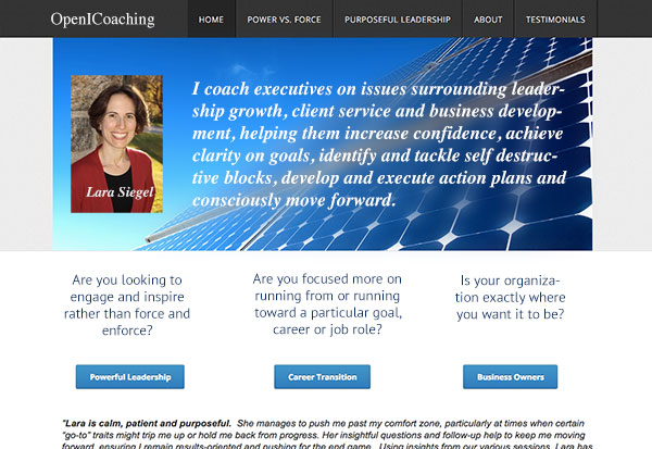
Here’s what I’d do to improve …
I like the colors of your site. That blue and bluish green with lots of white feels good to me. I like that. Also, I like your smile in your photo – that’s attractive.
As for a way to improve, I don’t recommend the first thing people see be a big image or a quotation from a sage. Instead, I’d put you front and center with a big message about what you can help clients achieve.
Here’s the after screenshot …

What do you think? Like the suggestion? Have ideas to make it even better? I’d love to hear from you. Just comment below.

