Website Review for Angela
To improve Angela van de Riet’s coaching website for client attraction, here are before-and-after images along with my suggested tweak.
Want me to review your website? Just schedule some quality time with me here, and we’ll find high-impact yet easy-to-do enhancements to improve your website for client attraction.
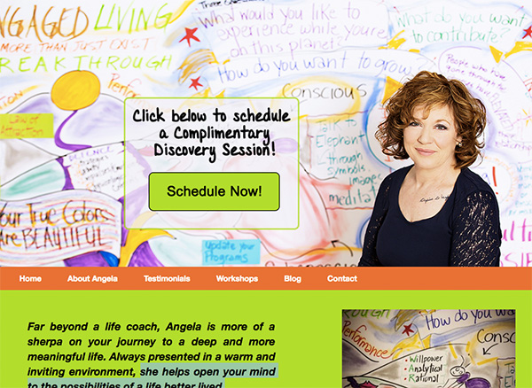
Here’s the before screenshot …

Here’s my suggested tweak to be more attractive …
There’s a lot I like about your site: lively yet not overwhelming, fun colors, nice photo of you and simple menu. Great!
I suggest adding benefits to the discovery session invitation and making it go to a form instead of just a link to an email address that opens up my email program. It’s very clunky, odd and won’t work often because people often don’t use their device’s default email.
Here’s the after screenshot …

Does this spark any reactions, thoughts, ideas, or suggestions? Let’s hear it! Post below. 😉

So much better. A very good invitation that promise immediate good results 😀
One other thing I’d do is change the word Get, as in Get your Free to, Claim your Free
Good to see a Benefit in the schedule now box.