
Coaching Website Tweak for Ciara
If you want me to review your coaching website schedule some quality time with me here and we’ll find high-impact yet easy-to-do enhancements to improve your website for client-attraction.
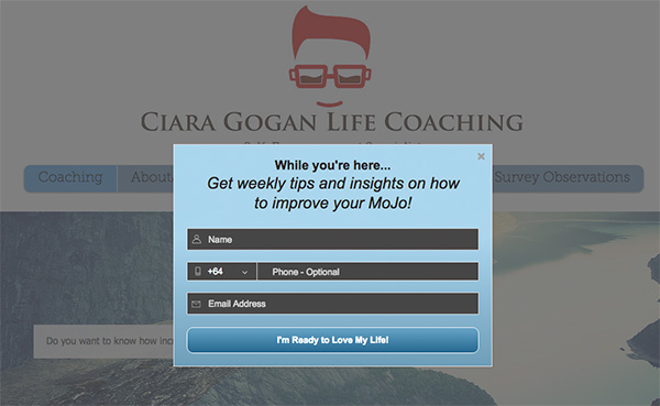
Below is a before-and-after visual for one suggestion to to grow Ciara’s list. Her life coaching website is here.
Here’s the before screenshot …
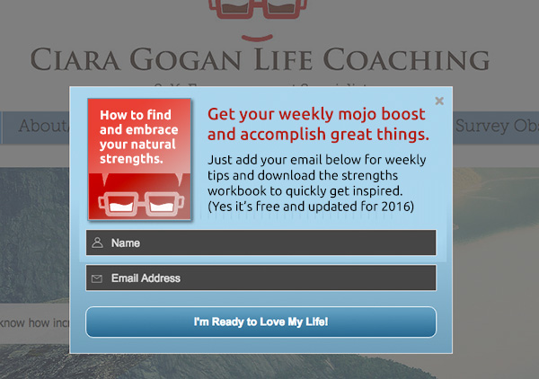
Here’s my suggested tweak …
I like the cool logo (make that smaller to the left, too much of a space hog).
I also like that you have a prominent opt-in box to keep in touch. It’s a good marketing move to grow a list.
But I’d make that invitation to join your list incredibly irresistible. Two things I’d do is highlight more value for joining your list and give them something they can instantly digest like a pdf download or video.
Here’s the after screenshot …
What’s your take? Got ideas to improve further? Dislike something? Love to hear from you. Comment below.
Something that glared at me was for the request for a phone number.
Warm them up first. Maybe a couple of contacts later.
So I can’t add anything as Kenn has already stolen my thunder.
Great point Bill. Yes, I personally avoid asking for too much or things unneeded info. I prefer to warm up, develop the relationship gradually, win trust.
But I can also respect that if someone has a plan (say to include phone number as a qualifier), then hey, see how it goes.
Try, test, learn. I’ve found odd things to work and tried-true to fail.
Great suggestions, thanks so much for the review! I’ve made a couple of tweaks based on your suggestions. I need to create something for my immediate share for subscribers, as soon as I do, I’ll re-edit my opt-in box!
Thanks again,
Ciara
Excellent. Thanks for sharing your site, help others learn as well. Funky glasses ;D