Mark’s Educational Diagram and Why I Love It for Coaching Websites
(Hey Mark, if you’re reading this, a big thanks for all the work you do on helping folks apply primal “lessons” for good health.)
An amazing way to bring visual life to your coaching website and build your image as a expert is to create an educational diagram, or more futury and funly called an infographic.
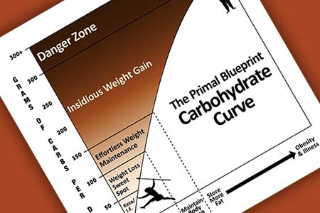
Below is Mark Sisson’s (health guru at Mark’s Daily Apple.com) “carb curve” which teaches people about carbs and how it leads to weight gain. It’s a super hand visual if you’re managing your weight.
Here’s why I absolutely love it from a website and marketing stand point.
1. It’s got a simple, relevant title.
The street name is “carb curve” but the official name is longer as The Carbohydrate Curve.
2. It’s teaches you something simple but important and you can using it right away.
It’s easy to see that too much carbs will lead to weight gain, and lead to too much fat, and that leads to illness. While there’s much debate about carbs, health and nutrition veterans all around agree that reducing carbs will do a lot of good for a lot of people.
3. It’s easy to understand.
I especially love the bottom part of the graph that sections out 3 key ranges of “burn more fat”, “maintain body comp” and “store more fat”. That really dumbs it down. Verrry Niiice!
4. It’s got neat little graphics.
I love the chubby office guy and the lean long-haired hunter. It hammers down the message. It adds fun while teaching.
Excellent!
5. It’s got his brand.
He’s coined the term “primal blueprint” and it’s a framework for all of his stuff – his book too.
I like that in the title.
6. It markets his business virally.
This little graphic is all over the web.
It’s easy to share and so useful, people can’t help but talk about it.
How can you come up with a neat visual to teach a simple concept that’s at the heart of your coaching business, process, beliefs?
Some questions to help you think up your handy infographic …
- What’s one deep belief you have about success? A truth?
- What’s something simple that many of your clients (or target clients) need to learn?
- Is there a basic notion that helps your ideal clients immensely?
- What are the 1, 2 or 3 keys to success for your target client (or one of your target markets?) For this question you could use the Venn Diagram approach for your visual.
Got any ideas? I’d love to hear about them. Maybe we can flesh out a home run for you. Just post your ideas below.
Bonus Kenn Points if you can quickly rough out a sketch on paper and upload it. Hehe.