Site Review – Mireille
Below is the before and after image for life coach Mireille Hoekstra’s website. Thanks for sharing it Mireille.
For others who want a quick eye on your website, you can post yours (for free) to The Coaches Support Group on LinkedIn. Managed by my homie EG Sebastian. Feel free to tell him I sent you for free coffee.
If you want to find the best ways to turn your stuck website into a lead-generating monster, then book some quality time with me.
Onto the review …
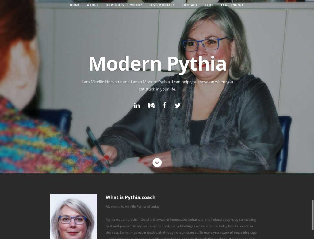
Here’s a screenshot of your website as it is right now.

I like the big smile on your face on the homepage. It’s warm and friendly. That feels good to me.
The simple modern layout looks good as well with the simple menu across the top, and essentially a 1-column layout for content. I feel good that the website will be be easy to use.
Two things that jump out at me for opportunities to increase engagement, improve readability, which gets people diving into the content to see how great a coach you are.
1. The big phrase “Modern Pythia” is confusing.
At first, I thought your name was Modern Pythia. Then it wasn’t when I read the tagline.
Since I don’t know what Modern Pythia is, I’m starting to want to just leave your website.
The part that says “I can help you move on when life gets stuck” is a good thing to have. At least I know why I should be at your website.
I suggest you get rid of Modern Pythia (unless your ideal clients are followers / students / learners of that) and instead make big and bold the phrase “I can help you move on when life gets stuck”.
2. Next, your website is very hard to read with the grey on black text in the body content.
I wouldn’t read it, but just leave at that point. It’s just too hard.
I recommend you use white on black in that section of your website.
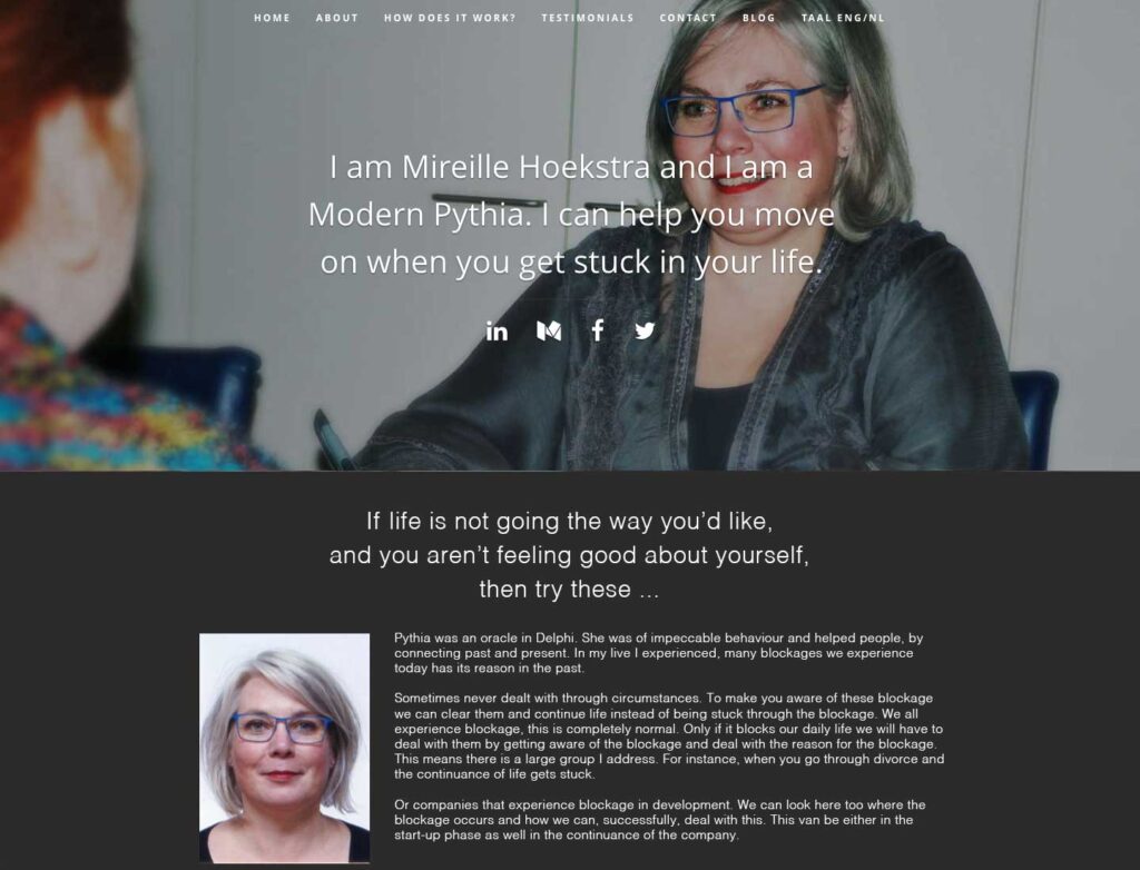
Here’s an after screenshot to illustrate …

In this image, the tagline is now the prominent wording at the top of the homepage. Also, the text in the next section on the page is now bright white and easier to read.
Thanks Mireille for sharing your website.

