Website Review for Nancy
To improve Nancy Abdo’s life coaching website for client-attraction, here are before-and-after images along with my suggested tweak.
If you want me to review your coaching website schedule some quality time with me here and we’ll find high-impact yet easy-to-do enhancements to improve your website for client-attraction.
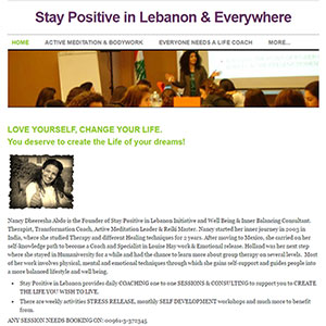
Here’s the before screenshot …
Here’s what I’d do to improve …
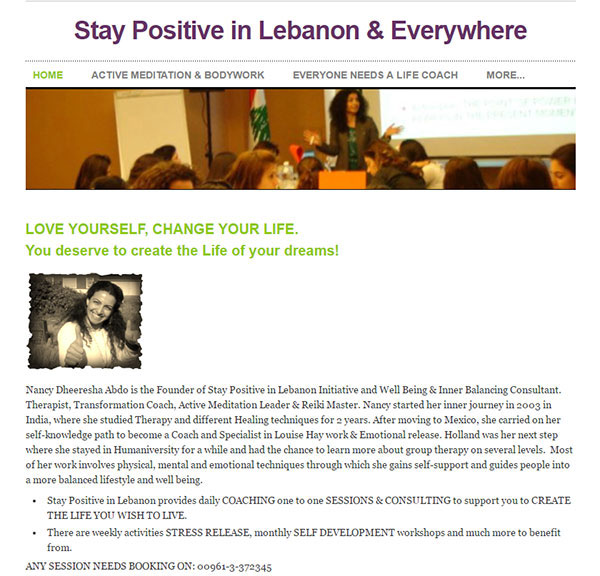
I like that you have a positive smiling picture of yourself on the home page. It’s friendly. Nice!
I don’t like Weebly because of the ads which cheapen your site and makes the link ugly and hard to work with. Also, most sites I’ve seen on Weebly have messy, sloppy layouts – especially when tweaked by site owners.
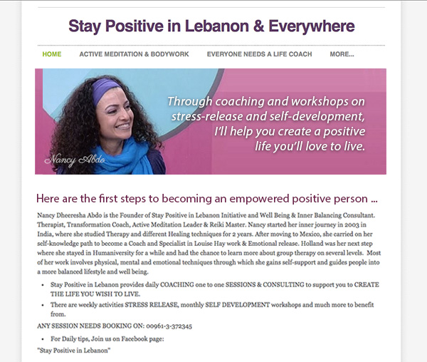
One thing I would do right away is ditch the fuzzy, weirdly cropped image and replace it with a good shot of you and positive text.
Here’s the after screenshot …
Does this spark any reactions, thoughts, ideas or suggestions? Let’s hear it! Post below. 😉