Coaching Website Tweak for Rebekah
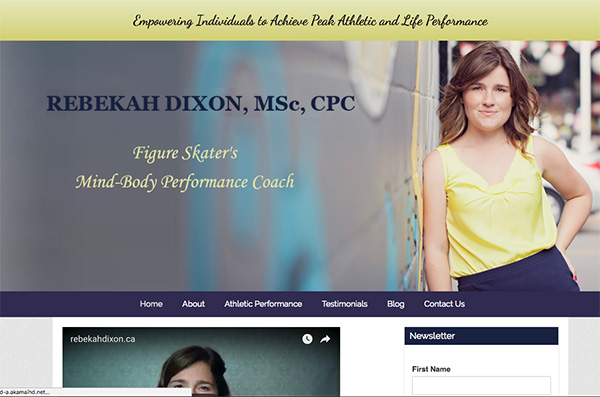
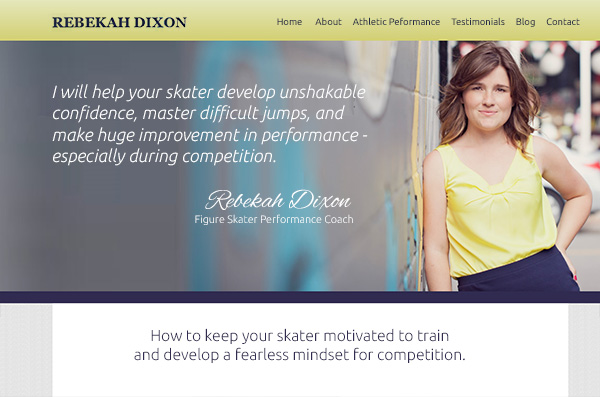
To improve Rebekah Dixon’s performance coaching website for engaging visitors quickly, here are before-and-after images along with my suggested tweak.
If you want me to review your coaching website schedule some quality time with me here and we’ll find high-impact yet easy-to-do enhancements to improve your website for client-attraction.
Before screenshot …

Here’s my recommendation …
I like that your picture is right on the home page and that your website is your name. It’s clear that this is a website about your services. Good.
I suggest adding more content about the benefits in the center area and putting the menu at the top where people expect it (yes, it does move there after scrolling down).
After screenshot …


