Example of How to Get Visitors Excited and Engaged in Your Site
I’ve personally and publicly reviewed about 200 coaching websites, and I can say, hands-down, without a doubt, the biggest area of improvement is communicating value on the home page.
If you want yours reviewed, find me on LinkedIn and post your site. If you’d rather not wait, then schedule some quality time with me here, and we’ll find high-impact yet easy-to-do enhancements to improve your website for client attraction.
Here’s another review of a coaching website …
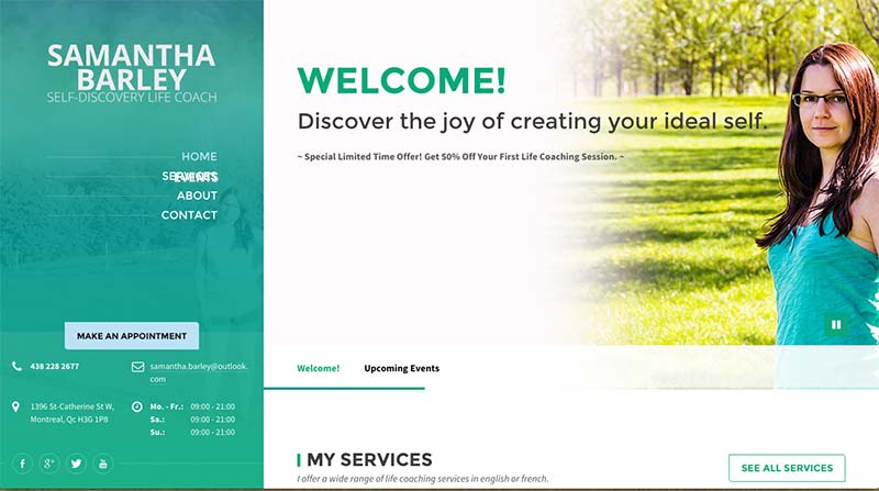
Here’s Samantha’s website BEFORE:

I like the colors.
I think she’s got a nice photo of herself. She has a smart look and a good posture.
I like that the benefit, “The joy of creating your ideal self”, is in big letters and very prominent on the home page.
Three ideas to improve:
1. Make the headline juicier by adding more benefits. People need the promise of great things at your site, and they need to see this right away.
2. Ditch the sliding images and let people choose where they want to go. It’s more important for people to believe your site is worth exploring BEFORE they know about the upcoming event.
3. Use just one menu, not two. You don’t need two menus because your site is not that complicated. The double menu (let and welcome/events menu) just makes it confusing.
The most important thing is that people need a GREAT reason to be at your website and explore.
There needs to be a promise of great value. Great possibility.
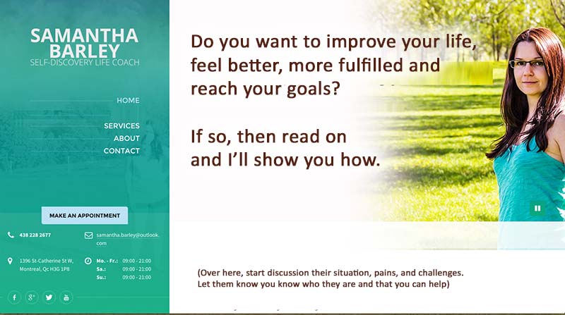
I took some content from you about me page to enhance your headline. See this FIRST AFTER:

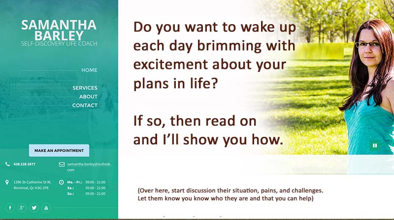
Then I juicified the words with what I think is more exciting. See this SECOND AFTER:

Remember, people need to know WHY to spend time at your site, and it needs to promise BIG value.
