Coaching Site Tweak for Sharon
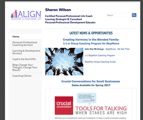
To improve Sharon Wilson’s training and life coaching website for engaging visitors quickly, here are before-and-after images along with my suggested tweak.
If you want me to review your coaching website schedule some quality time with me here and we’ll find high-impact yet easy-to-do enhancements to improve your website for client-attraction.
Before screenshot …

Here’s my feedback to improve it …
I like that the logo is in the upper left area. That gives me some grounding.
The page feels scattered to me though. There are too many fonts, images, and thingies floating around without a logical layout. I see this often with Weebly websites.
Also, there’s no clear reason for me to stick around. What is the big picture reason that I should stick around and explore?
I highly recommend a simpler layout with a big headline or tagline.
After screenshot …


