Sharon’s Website Before and After
This before and after is for a member of one of my LinkedIn Groups, where I’ve been reviewing coaching websites for free. If you want yours reviewed, find me on LinkedIn and post your site.
If you’d rather not wait, then schedule some quality time with me here, and we’ll find high-impact yet easy-to-do enhancements to improve your website for client attraction.
Sharon’s site is here: http://www.rhythmandrhyme.co.za
My tips for improving it to attract clients …
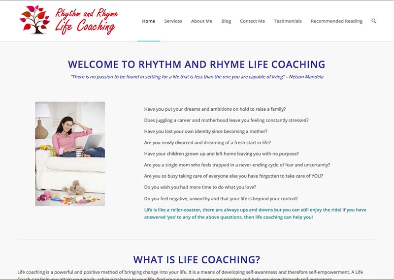
I see lots of white. That feels great! A big plus. Cluttered, noisy sites are a minus.
(But, you may be surprised at how some sites look bad really do great, but that’s a story for another day).
I dislike your domain name because I bet 95% of English speakers will struggle to spell those words.)
The list of challenges at the top is a great move. It focuses on the visitor. Awesome!
To improve, I’d make some of this very prominent.
As your site stands, it’s not clear who your website is for and why they should be there within a few seconds.
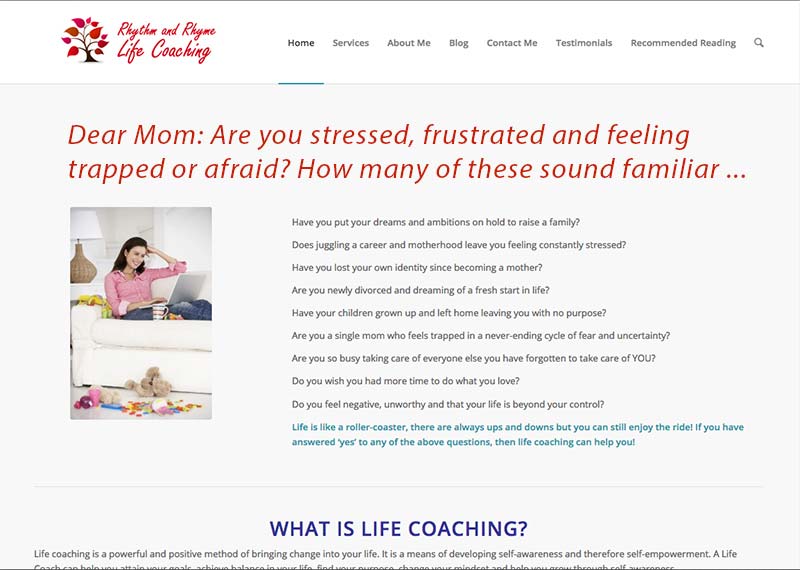
To fix that, I would make some of the bullets prominent as a big, juicy headline.
I’d use this for starters, “Dear Mom: Are you stressed, frustrated, and feeling trapped or afraid? How many of these sound familiar …”
Before:

After:

Doing this will get people to know this site is for them and then dive into the content.
In addition, if you want more clients from your site (from the web) to fill your practice and you want them consistently coming to you, then make sure you:
- Get visible in front of ideal moms.
- Drive traffic back to your site to grow to trust with them
- get chats with them so they can see how you coach (and like you!)
- make juicy offers to hire you so that it’s an easy yes for them.
Again, you’ve got a nice clean site. Make the headline more juicy and engaging and to improve it to attract clients.

Hi Kenn,
Thanks again for all the valuable and useful information. I agree that less is more…and have been learning from the folks at No Side Bar and StudioPress. I like the minimal clean look.
Looking at the before and after, I can see how a headline can draw people in.
My site is very basic and new. I am learning WP slowly….Currently, it’s a Blog with an About page. I am currently creating content to add coaching options and packages while I continue to develop a business plan.
Thanks for the guidance!
Kelli