
Website Review for Stanley
To improve Stanley D. Truskie’s executive coaching website for client-attraction, here are before-and-after images along with my suggested tweak.
If you want me to review your coaching website schedule some quality time with me here and we’ll find high-impact yet easy-to-do enhancements to improve your website for client-attraction.
Before image …

My recommended tweak …
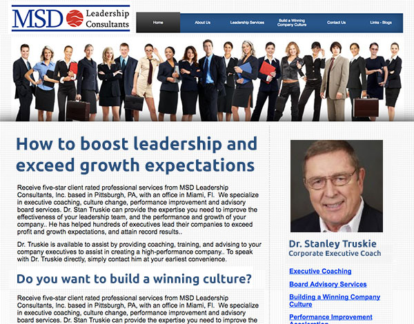
I like your simply located and short menu. That gives me comfort that it will be easy to get around your site. Nice.
I also like the image with lots of smiling business people. If it were one or two, it would probably be cheesy. 😉
To improve your site’s ability to engage people right away and get them to read your content, ditch the big “Welcome” headline and replace it with benefits and a reason to read further.
After image …
Does this spark any reactions, thoughts, ideas or suggestions? Let’s hear it! Post below. 😉
Nice tweak,You gave me some ideas. Thanks