Go Deeper – a Website Tweak for Stephane
To improve Stephane Loiret’s coaching website for engaging visitors quickly, here are before-and-after images along with my suggested tweak.
If you want me to review your coaching website then schedule some quality time with me here and we’ll find high-impact yet easy-to-do enhancements to improve your website for client-attraction.
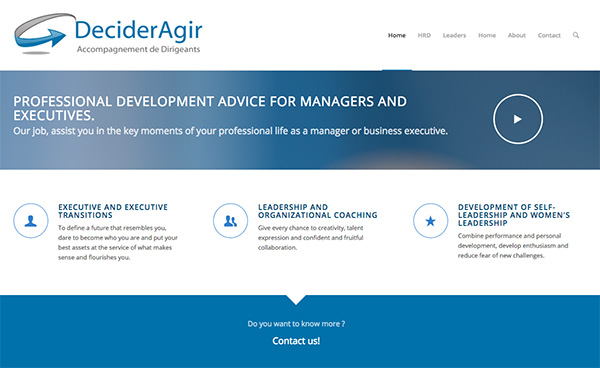
Before image …

Here’s my tweak …
I like the professional blue color. I like the video (tho I don’t speak French). And I like that you state “professional development advice for executives and managers” – it gives me an idea of what the site is about.
But I’d go deeper into what’s the be gained from “advice in key moments”. Put the juicy stuff in big letters.
(Also, small thing, there are 2 home links on your site. It’s a little WordPress hiccup to fix.)
After image …


