Website Client-Attraction Tip for Steven
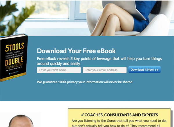
To improve Steven Logreira’s website for client-attraction, here are before-and-after images along with my suggested tweak.
If you want me to review your coaching website schedule some quality time with me here and we’ll find high-impact yet easy-to-do enhancements to improve your website for client-attraction.
Before image …

My recommended tweak …
I like the fresh, modern layout and I bet it’s good for mobile devices. Also, I like the clear message in big letters and that it’s centered on the pain of tech overwhelm. Nice. Also like that your freebie and email list offer are prominent. Good.
I suggest making the benefits clearer. As it stands, I can’t read the book cover other than “5Tools” and “Double”. Also, in the text, the only value I see is “turn things around quickly” – which means little to me. I’d go back to the pain which is frustration and overwhelm with implementing technology.
Also, your tagline under the logo is too tiny to read – just get rid of it.
After image …

What do you think? Like the suggestion? Have ideas to make it even better? I’d love to hear from you. Just comment below.


I think the new text really captures your intent and speaks to the prospective client. However…. the images of the woman with crossed legs and the half head i find unappealing.
Yeah … I should make it clear that this screenshot is a bit scrolled down on the page. Glad you pointed that out Charlotte.
Hi Steven…..
Your site and message are positive but I don’t get the half head at the bottom.
I cannot see your name anywhere?
Billl
Yeahhh … the screenshots are from scrolling a bit down on the page … So there is more visual above and below.
I focused this tip on the opt-in box area.
Glad you commented BIll.
I love the layout and the website tells me quickly what it is about and what I can get from Steven.
One thing that caught my attention in a weird way is description of the Discovery session:
Contact me today for a free no-obligation Discovery Session that will have three objectives:
I will be able to understand your business fully
I will look at what’s working and what’s not working
I will provide solutions to the things that are not working
It left me feeling that I have to invest time in the call, so Steven can get stuff out of it. The emphasis being on the “I”. Even though logically I know that he must do that to be able to help me, what would be more compelling is letting me know what I, as a prospective client, will get out of the call.
Something along the line of:
You will identify exactly what is not working in your business
We will clarify your business goals and objectives, so every action you take from now on will propel your business forward
At the end of the call you will know exactly what to do to maximize your success
If worded more about me and the benefits I would get, I would be much more likely to call
Hope this helps. Otherwise it looks great.
EXCELLENT suggestion. Yep. great!