Tip to Engage Visitors Quickly for Samantha
To improve Samantha Marshall’s equine gestalt coaching website for engaging visitors quickly, here are before-and-after images along with my suggested tweak.
If you want me to review your coaching website schedule some quality time with me here and we’ll find high-impact yet easy-to-do enhancements to improve your website for client-attraction.
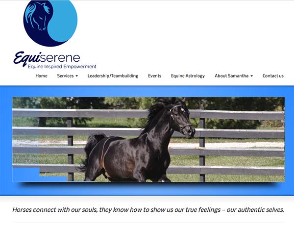
Here’s the before screenshot …

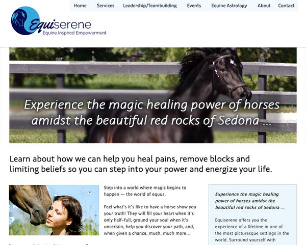
Here’s what I’d do to improve …
I love the images and the logo is pretty sleek. Nice. You’ve got a nice simple menu too. Good job.
The homepage’s job is to grab attention and get people to engage in the content – fast – within seconds.
The biggest thing I’d do is make space at the top of your home page and get some juicy content in there.
You can reduce the size and space of the images and still give that great horse-healing effect.
Here’s the after screenshot

What do you think? Like the suggestion? Have ideas to make it even better? I’d love to hear from you. Just comment below.

