Coaching Website Tweak for Veronica
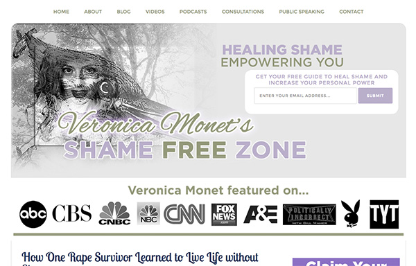
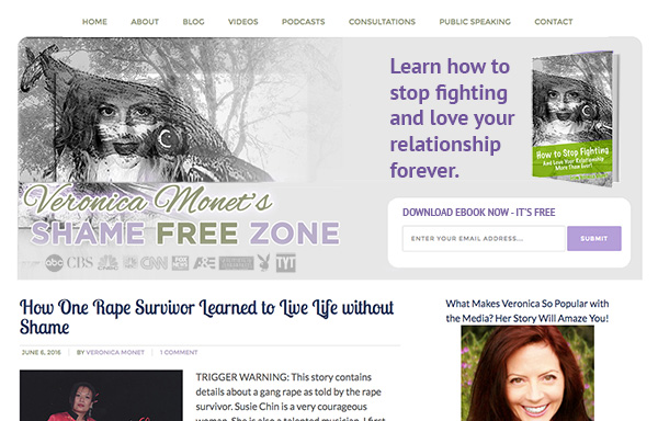
To improve Veronica Monet’s sex and relationship coaching website for client-attraction, here are before-and-after images along with my suggested tweak.
If you want me to review your coaching website schedule some quality time with me here and we’ll find high-impact yet easy-to-do enhancements to improve your website for client-attraction.
Before screenshot …

My suggested tweak for client-attraction …
I really like the image and colors and feeling, seems relaxed and safe perhaps for the person ashamed of something they want to get past.
Also I like the email list and free download offer. That’s great for growing your database – the gold 😉
What I’d do to improve engagement (both opt-ins and article reading) is get the ebook visual and blog headlines higher up on the page for instant access without scrolling. Also, you’ve got a great headshot – expert-like, super-friendly. That’s a big plus.
After screenshot …

What’s your take? Got ideas to improve further? Dislike something? Love to hear from you. Comment below.


Hi Veronica… I like what I see and the only thing I would add is a requirement for a name even if only a first name. It makes further communication in the future from you more personal.
Bill