
Website Glow-Up for Life Coach Alan

Most coaches don’t need a brand-new website — they need clarity. A site that feels scattered, outdated, or “not quite me” isn’t broken; it just isn’t aligned. That’s what a website glow-up is for: refining what you already have so it reflects your strengths, communicates with confidence, and builds trust with the people you most want to reach.
Alan Ter Morshuizen (AnOptimalLife.com) has a solid foundation, but his homepage hero section felt too scattered and generic. His brand is about clarity, strength, and authenticity — yet the top of the site wasn’t showing that.
In this post …
- My Gut Reactions Video
- The BEFORE Screenshot
- The AFTER Image (Idea 1)
- The AFTER Image (Idea 2)
Enjoy!
My Gut Reactions Video
There are over a dozen fresh ideas in this 32-minute video on YouTube. In the future, I’ll probably cut this down to a minute of the juiciest bits. But please do comment below with your thoughts.
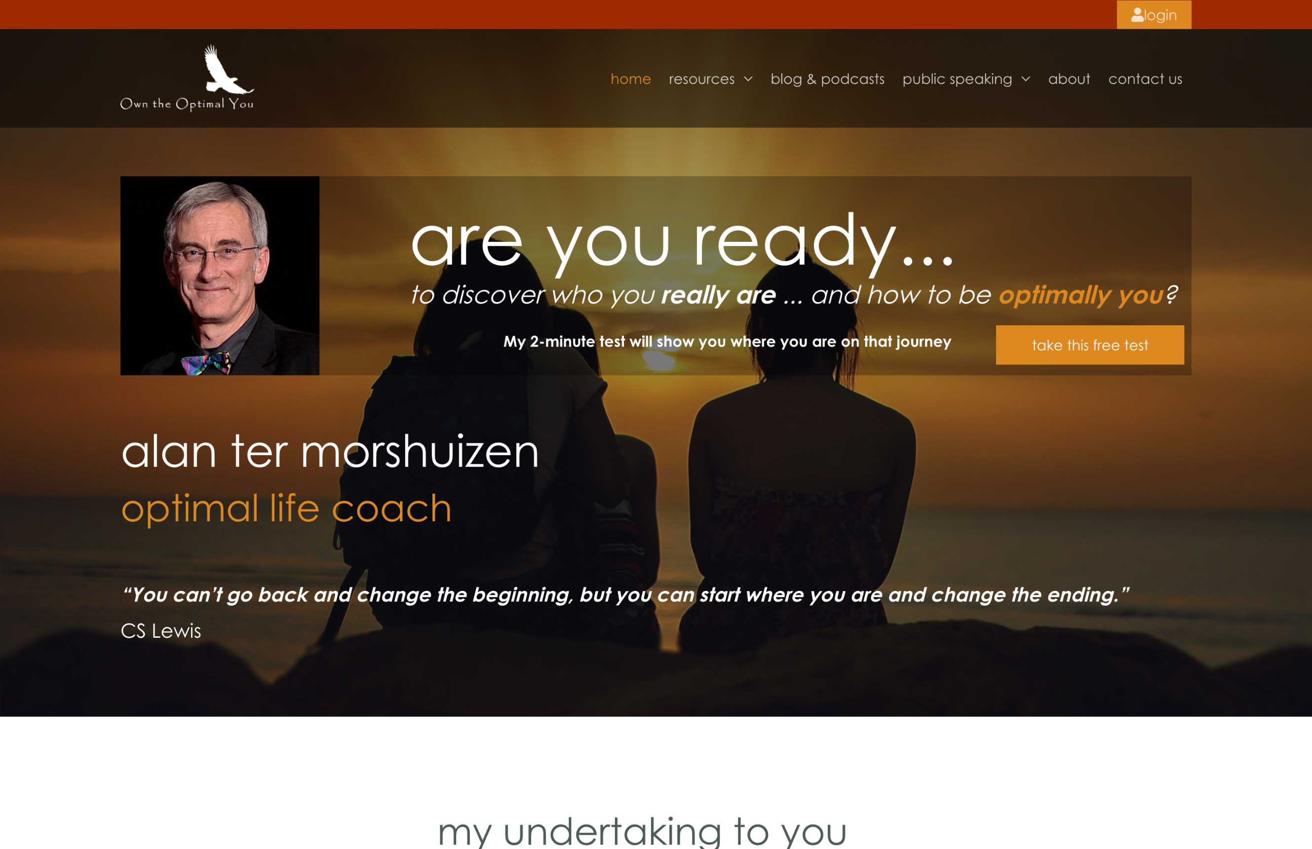
The BEFORE Screenshot
Here’s a screenshot of the top of the homepage, so you can see what we’re starting with.
The AFTER Redesign (Idea 1)
Visually, Alan’s site was tricky because it had more than half of the coaching brand archetypes mixed in. Here, I lead with Sage and a touch of Jester, reworked menu area and clearer message.
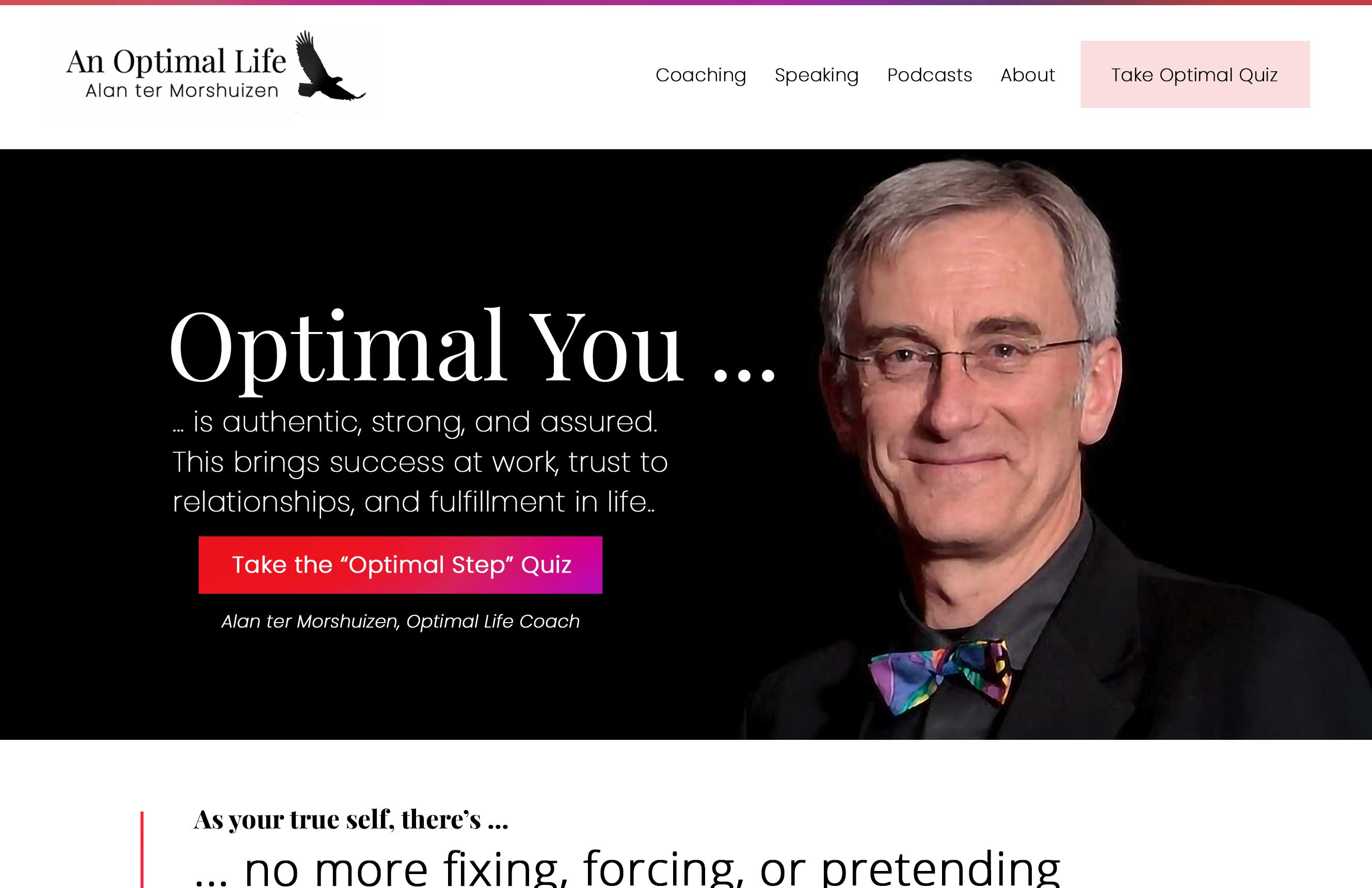
What’s your take? Tell me in the comments below. I’d love to know.
The AFTER Redesign (Idea 2)
Here’s a revision with the Explorer and Sage combo. The bird in the logo works well with the mountain picture found on his website. Can you see a better call to action, clearer message, and easier-to-understand website? Share your thoughts in the comments.
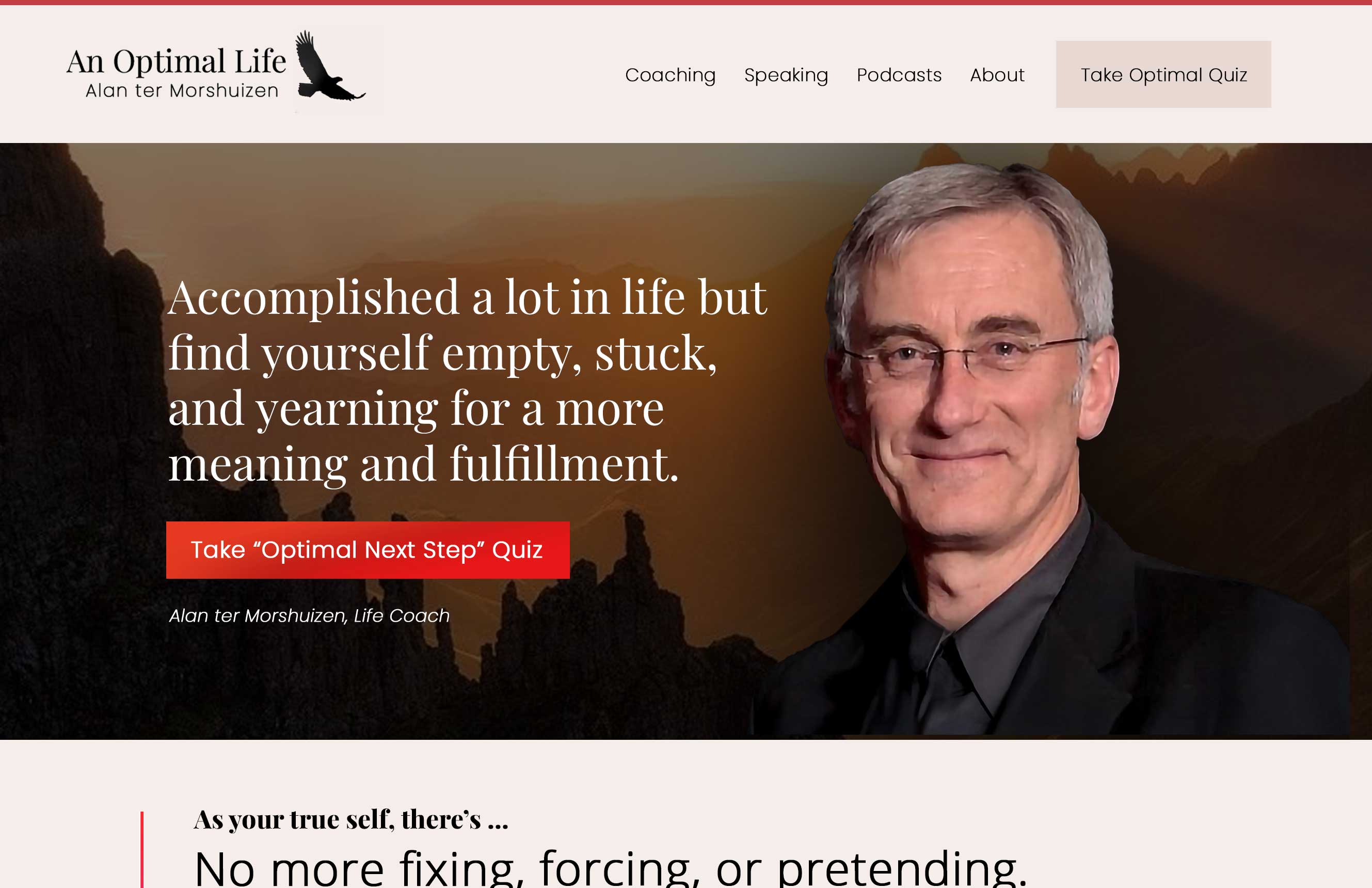
Bowtie gone! The mountain vibe is a classic visual for overcoming a challenge — like hiking a mountain. Like? What do you think? Tell me in the comments below.
Both options are great improvements. I noticed that the language on the Sage/Jester focused on the benefits of his coaching while the language on the Explorer/Sage one focused on the pain points. Was that a deliberate choice? Would you ever swap them or does that interfere with the aesthetic? Also so curious to know which one he likes best!