Three Usability Tips to Improve Engagement
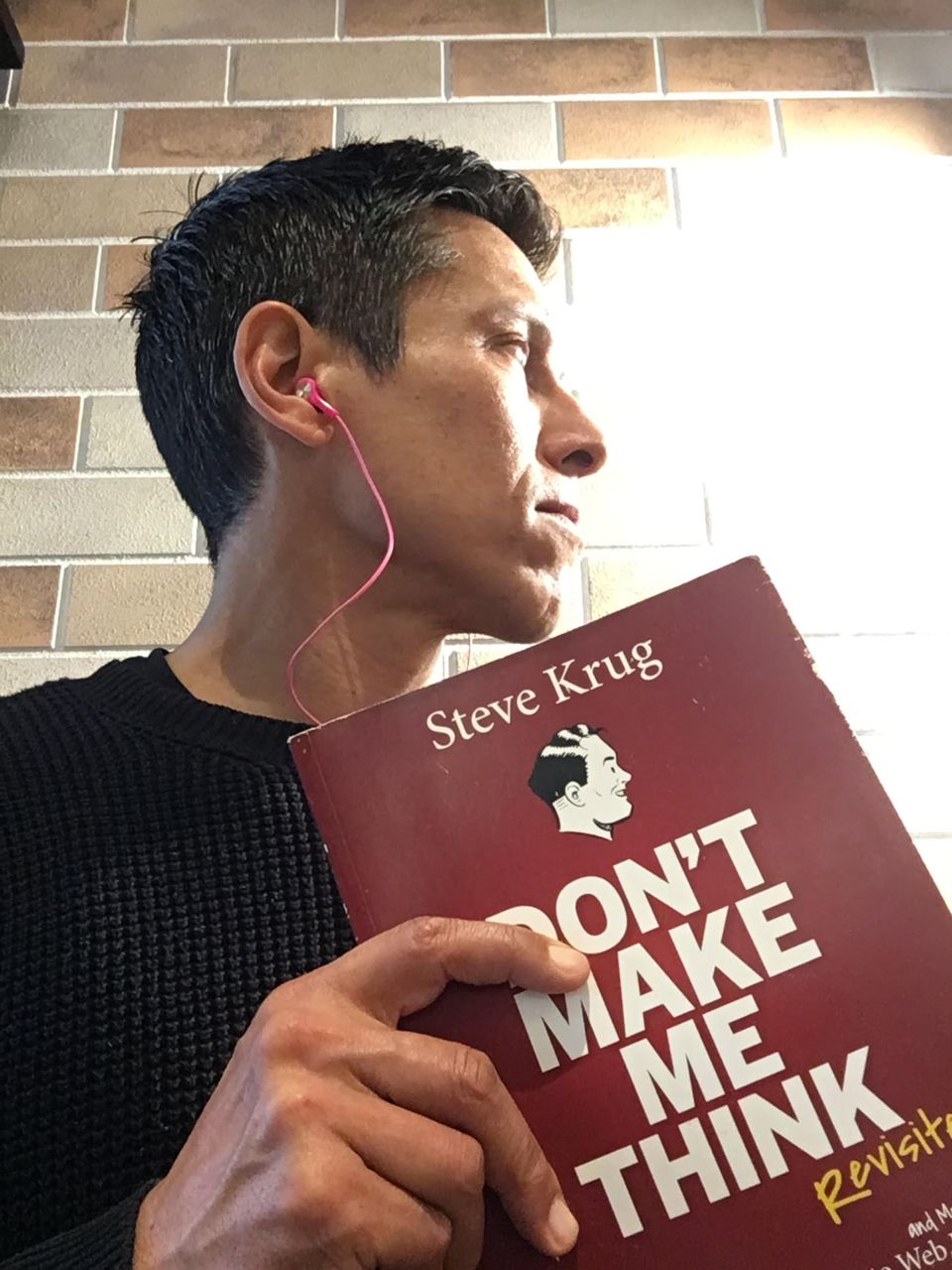
I just noticed that I had 2 copies of this book – one of my favorites that influenced how I create websites for coaches.
I love Steve Krug’s book on web (and mobile) usability titled, Don’t Make Me Think.
Over the years, in reviewing over 1000 coaches’ websites, I would wholeheartedly say that “confusion” is the biggest problem.
Confusion, lack of clarity, disorganization, complicated, and in a word, “messy.”
And when you put order to your online chaos, traffic, conversion, visitors, lengths-of-stay always go up — which leads to more subscribers, followers, and client leads.
Three tips this week on website usability learned from Steve:
1. Try cutting your content in half, then in half again. When I first read this, I was blown away.
2. Sit with someone, anyone, and watch them use your website. That has been an eye-opening event every time I’ve done it.
3. We don’t read (or use) websites they way we read books — word by word, and page by page. Instead, we scan, skip, jump, and hop all over the place. So, plan your content for this with headlines, subheadlines, smaller chunks of text, and links.
I should post a pic of the new wall canvas art I had custom made — I think it’ll tickle your coaching bones.
Lots more tips for coaching websites in my handy not-so-little book The Coaching Website Guide.

