Coaching Website Mistake – Sliders Suck
Sliders – not the mini bite-sized burgers that you’ll pay double for at posh places, but the cool-looking effect of images sliding across your homepage (staple to almost all WordPress themes) – suck!
By suck, I mean they are poorly used by coaches to generate business on their site. The main reason they suck is that they take away control from visitors, requiring them to wait for content to slide into view.
In this article, I will go into six reasons why sliders suck and five ways to make them more effective if you’re going to use them.
By sliders, specifically, I mean taking a series of pictures and sliding them across your home page or fading them in one by one. This may be with or without accompanying text.
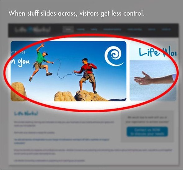
In the example below, the page has pretty pictures that slide in over time.

5 Specific Reasons Why Sliders Are Not Ideal
- They go too fast. They leave visitors with a “Woah! Wait a second!” kind of annoyance and scrambling about to figure out how to go back.
- They don’t deliver more. Most coaches use sliders to show off pretty pictures without leading the visitor to more helpful content. Your site should be intent on delivering helpful content.
- They are hard to control. Often times there are no buttons that allow visitors to go between slides, or the control mechanism is tiny and difficult to find.
- They are space hoggers. Rather than showing off pretty pictures when people are on your homepage, you should be engaging them with content that’s directly relevant to their situation. And the top part of your home page is prime real estate for making that kind of content visible. Sliders often hog that space.
- They add more work. Putting a slider on your home page for the mere sake of having something “cool” is NOT cool. Be intentional about your content and share content you know will help lead visitors toward overcoming their challenges.
- They add technical complexity. They are more likely to be dysfunctional on your phones and likely add more technical headaches to your site development.
- They confuse. On many sites, when these pretty pictures are clicked upon, they lead visitors to new pages that are unrelated to the image. Confusing.
I rarely recommend sliders. Instead, simply make a list of the elements you want to highlight.
If you’re thinking of highlighting top content on your site, say a blog post, a new coaching program, and a new talk you’re going to give, simply list those three things on your homepage with a title, short summary, and a “read more” link. A column format aligned horizontally makes for nice show.
However the proof is in the pudding.
However, the proof is in the stats! If you’ve got a strategy for your sliders other than trying to “be cool”, then you should determine a way to measure results. Test your homepage with and without the slider and see what works.
If you are going to use a slider, here’s what I suggest:
- Make your images “clickable” to other pages of your site.
- Use relevant text with your images so people know what to expect when they click.
- Have big next and previous buttons to help people go between slides.
- Make sure you also have a “read more” text link to indicate that there’s more information to be clicked.
- Make sure the page you send them to is clearly relevant to the slide.
The takeaway message is this …
As cool as they look, sliders suck on almost all coaching sites. They aren’t done well, add complexities, and take control away from visitors. Save sliding images for sharing vacation photos with friends and opt instead for simply delivering your content in easy to read text.
I wanted to ask you …
Are you using sliders? Trying to be cool? Wondering if they are of any use? How about sitting down with a few friends to see how they react to it? What might be a better way to deliver your great content?
I’d love to hear your comments.

