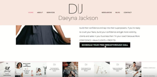
Coaching Website Review – Business Coach Daeyna
Here’s a quick website review for Daeyna Jackson. Her business coaching website is at daeyna.com
Click here if the video doesn’t show.
As I create, review or enhance websites, I always keep this guiding question in mind, How can I make this website better for attracting clients?
Key points for Daeyna’s business coaching website:
- Good job on the domain name and logo matching
- Careful about complex backgrounds and text on top
- Avoid having a big logo that takes up too much space makes accessing content tough, see the problem here and how to improve it.
- Spell out your message in more detail, see how I suggest does that
- When you ask people to do stuff, make it ultra clear – see how with her workbook offer
- See how smaller chunks really matters as I try to read some copy
- Lots of other tweaks
Please do me a solid and hit LIKE.
It really makes my day to know I’m helping you. It’s like a little cyber cookie of feel good hormones that turn my computer face (often too serious) into a loving kindness look (better for my longevity).
[fblike]

