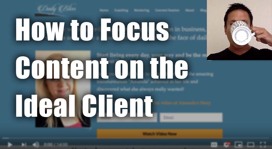
Coaching Website Review – Lifestyle Coach Gaye
Here’s a quick website review for Gaye Kuelsen. Her lifestyle coaching website is at dailybliss.com.au
Click here if the video doesn’t show.
As I create, review or enhance websites, I always keep this guiding question in mind, How can I make this website better for attracting clients?
Key points for Gaye’s lifestyle coaching website:
- Great positioning and size of logo and location for your menu.
- The menu is obvious, intuitive, and easy. Excellent.
- There are some positional and spacing issues with text and headlines a bit too close to other elements.
- A good thing to focus on is the block of content just below the initial screenful at the top. This is the story of why your coaching business exists. As it stands, the 3 column look makes it feel more like some options as opposed to a lesson or learning. I suggest letting it flow from top to bottom, like an article, ending with your free consultation offer.
- I like the attention to the ideal client and their challenges and desires. Superb.
- There were a few other little things that caught my attention to tweak up.
Want to say thanks? Just hit the LIKE button here. I appreciate it.
[fblike]

