Coaching Website Mistake – Using Dropdown Menus
The harder you make your site to navigate the less time people spend time at it. That means lost traffic, lost clients, and lost sales.
One big frustration point is the dropdown menu. These are the menus that open up to reveal a sub-menu when you roll over them. Essentially, another menu “drops down.”
They are very sexy to designers and site owners because of their cool visual effect. And that effect leads to the thought, “How can I incorporate these dropdowns?”
But this ends up causing more trouble than they are worth.
In this article, I talk about five reasons why dropdown menus are more trouble than they are worth. I’ll give you a simpler way to handle the menu aspect of your content.
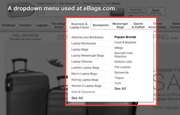
Here’s a quick screenshot of a dropdown menu used at eBags.com

Above, you can see that when you put your mouse over the “Business & Laptop Cases” menu item, this secondary menu drops down, giving you more links to click.
Problem #1 – Dropdown menus hide information.
Dropdown menus only show links to sub-pages if you roll over them. Thus, you can’t tell what links are there without digging. This is extra work on the part of the user. You make them have to stop and think.
While this might be good on shopping websites (e.g. buying shirts or shoes) where people expect categorizing, for coaching websites, this is not the case.
Users at coaching websites are buying something they are not familiar with, and their movement about your site is quite different.
On your site, the main goals are to list, build, share articles, generate leads, and sell coaching products or programs. You don’t need drop-downs in your delivery of content.
Problem #2 – Dropdowns require too much thinking.
When someone clicks on your “services” dropdown menu, for example, you may list Coaching, Consulting, E-Coaching, and Web Coaching.
And while these things may mean different things to you, your visitor has no idea what they are. They will have to start guessing and bouncing between them to figure out what they are.
That’s clunky.
Instead, you’d fare better with simply one page called “services,” and on that page, include a short summary of each service you offer with a link to learn more.
Problem #3 – You need a very steady hand (remember the classic board game, Operation?)
Dropdown menus require a steady hand. How annoying is it when these menus just won’t follow your mouse? Or do they disappear too fast?
Straining to get the menus to dropdown is painful. Don’t make visitors do that, no matter how cool the visual effect.
Problem #4 – The technology may not work.
The more complicated you make your site, the less it’s going to work in other environments.
For example, your cool dropdown effect may not work at all on a mobile phone.
Moreover, using that menu will be a royal pain as your fatty finger on a mobile device is not as easy to maneuver as a small mouse on a big computer screen.
Problem #5 – They are too sexy for my shirt – it huuu-uuu-uurts!
If you’re a new budding coach and can spend too much time thinking about your content, then a dropdown menu will allure you into more extra thinking!
When you (or your designer) show you that this dropdown effect is available, he/she and you may want to “incorporate” that into your content and you may end up spending hours thinking about how you can use them to organize.
You don’t need to organize that much! Keep your site simple. For new coaches, there isn’t that much going on to warrant this level of content management.
Save dropdown menus for desktop software.
Programs like Photoshop or Word, which you use often and which have loads of tools, are perfect for dropdown menus. There’s a lot to organize and you’ll be using this software often, so it’s ok to spend time learning where things are.
For new coaches, just use a simple row of links.

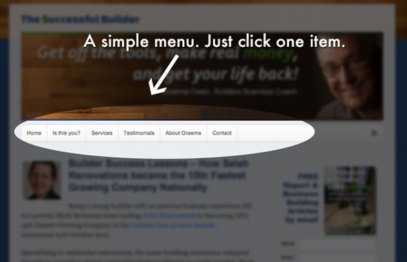
In the above image, there’s a simple row of links without dropdown menus. Just click on one of them, and you’ll go to that page. If there are deeper pages, you’ll learn about them there.
A simple row of links, five to seven, is perfect for a new coach’s site. You don’t need more than that to organize your content.
If you have multiple services, then make one page that has summaries of the services and then create sub pages for each service.
If you have a blog with multiple categories, then simply list the categories on the sidebar area – often the right-hand side of a website.
The essential message is to avoid dropdowns.
Keep things simple and use a single row of links in your menu. Avoid over-organizing. Keep things simple, and visitors will do more at your site, like subscribe to your list, comment on your blog, or contact you for coaching.
Let me ask you …
Ever wrestle with dropdown menus? Ever find yourself over-organizing your content? Ever struggle with your menus? What was the challenge? What did you do?
I’d love to hear from you.

