Coaching Website Colors That Look Great
What colors should I use for my coaching website? How do I choose colors that feel good? Which colors work for my brand and build trust with clients?
The endless number of color variations, palettes, and schemes can make your head spin!
Poorly chosen colors that clash or conflict with buttons, backgrounds, or text make things messy, hard to follow, and feel unprofessional, which turns off clients, and makes you afraid to share it.
While you’re not trying to win a design award, you do need to look like a pro, come across authentically, and attract the right audience.
When website colors work, EVERYONE can feel it, even if they don’t know why.
When a site’s design is good, it reflects your personality, builds trust, and makes people want to stick around. You feel proud to share it — and that confidence carries into everything you do.
Experienced designers can reverse engineer a design and explain WHY it’s good. There are design principles at work. For colors, we often love things that are familiar, that make sense, that are naturally found in the world. I get into more of this below.
But here’s WHY it’s so easy for colors to look off?
Typical messes come from trying to mix together these items without thinking about colors (as well as textures, feelings, messaging, your audience, and your business image).
- Stock photos
- A webpage template
- A logo
- Your photo
- Changing your mind often (no direction).
Thus, the key to good colors is less about picking the right color — and more about how your colors AND ALL of the visual design elements work together.
A Simple Way to Get Colors to Work
And so, through this post, I’ll give you tips from 20+ years online for choosing a fitting color and how use it in your website tastefully.
Eight color categories for your coaching website and coaching brand
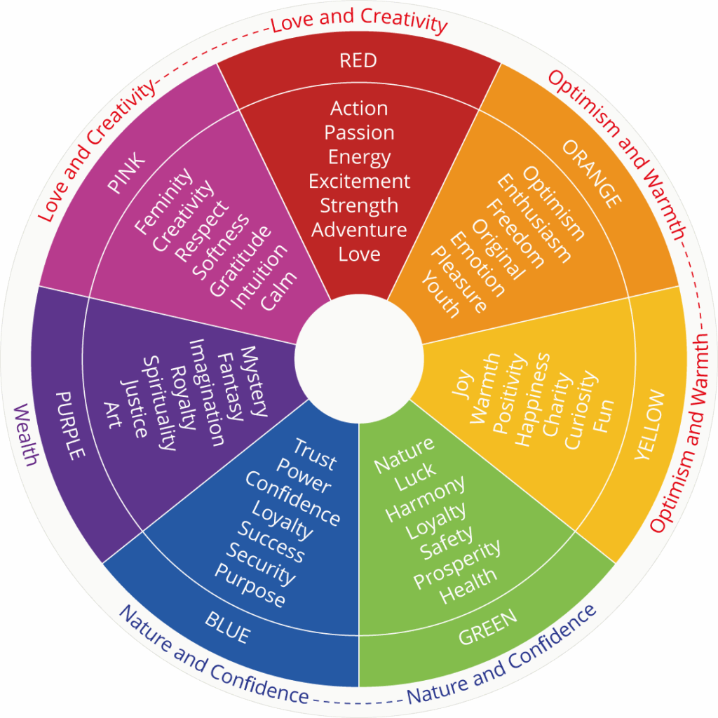
Source: Swift Publisher
Here’s a list of colors:
- Orange for energy and enthusiasm
- Yellow for optimism and happiness
- Green for growth and balance
- Blue for trust and stability
- Purple for wisdom and spirituality
- Red for passion and power
- White for simplicity and positivity
- Black for power and strength
At the end, there are a few examples of websites and colors on coaching websites and how they support the brand and message.
AND! I’d love to hear from you in the comments. Which colors do you like most? Which ones feel right for your brand?
1. Orange for Energy and Enthusiasm
Orange relates to these feelings, concepts, and words:
- energy, enthusiasm, attention, happiness, optimism
- fascination, creativity, determination, attraction, success, encouragement
- stimulation, heat, vitality, friendliness, vigor, youth
- red-orange — desire, passion, pleasure, aggression, action
- gold-orange — prestige, illumination, wisdom, wealth, high-quality
Coaching Niches with Orange
Career Coaches
Orange is often associated with enthusiasm and creativity, making it a great choice for career coaches who want to convey a sense of motivation and innovation as they help clients navigate career transitions or advancement.
Entrepreneurship Coaches
Orange can symbolize creativity, energy, and a sense of adventure, appealing to coaches who work with entrepreneurs looking to build dynamic and innovative businesses.
Motivational Coaches
Orange is an energetic and uplifting color that can inspire enthusiasm and excitement, aligning well with coaches who focus on motivating clients to reach their goals.
Youth Coaches
Coaches who work with young people might use orange to convey fun, energy, and a sense of playfulness, making their services more appealing to a younger audience.
Creative Coaches
For coaches who work with artists, designers, or other creative professionals, orange can represent creativity and originality, reflecting the vibrant and dynamic nature of their work.
2. Yellow for Optimism and Happiness
Yellow relates to these feelings, concepts, and words:
- laughter, hope, sunshine, energy, optimism, cheerfulness, joy
- joy, happiness, intellect, warmth, cheerfulness, mental activity
- leisure, lightheartedness, children, spontaneous, freshness
Coaching Niches
Life Coaches
Yellow represents optimism and positivity, making it ideal for coaches who focus on personal development and helping clients embrace new perspectives.
Creativity Coaches
Yellow is associated with creativity and inspiration, appealing to coaches who work with artists and creative professionals seeking innovation.
Leadership Coaches
Yellow symbolizes clarity and intellect, making it suitable for coaches who guide leaders to make insightful decisions.
Motivational Coaches
Yellow’s energetic vibe can inspire and motivate, aligning with coaches who energize and uplift their clients.
Youth Coaches
Yellow conveys fun and enthusiasm, making it attractive for coaches working with children or young adults.
In addition to choosing the best colors for your coaching business website, make the structure, content, and calls-to-action encourage visitors to reach out to you. I wrote about this in The Coaching Website Guide. Have a look.
3. Green for Growth and Balance

Green relates to these feelings, concepts, and words:
- health, new beginnings, wealth
- ease, relax, create balance, growth, security, possibility, spring
- calm, anticipation, hope, soothing, relaxed, diet, control anxiety
- stability, endurance, discipline, harmony
- nature, freshness, fertility, safety, healing power, restful eye
- hope, positivity
Coaching Niches
Health and Wellness Coaches
Green symbolizes health and vitality, aligning with coaches and promoting a balanced and healthy lifestyle.
Environmental Coaches
Green is associated with nature and sustainability, making it a natural choice for coaches focused on environmental awareness and sustainable living.
Financial Coaches
Green is linked to growth and prosperity, appealing to coaches who help clients achieve financial success and wealth management.
Life Coaches
Green represents growth and renewal, ideal for coaches guiding personal development and transformation.
Career Coaches
Green conveys growth and progress, which is suitable for coaches helping clients advance in their careers.
4. Blue for Trust and Stability
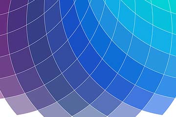
Blue relates to these feelings, concepts, and words:
- Conservative, traditional, calmness, relaxation, stability, reliability
- natural blues — water, sea voyages, consciousness, intellect
- business blues — masculinity, corporations, high-tech
- calm blues — relaxation, understanding, and softness
- strong blues — knowledge, power, integrity, seriousness, expertise
Coaching Niches That Use Blue
Life Coach: Uses blue to convey calmness and trust, creating a serene environment for personal growth and self-discovery.
Executive Coach: Blue represents professionalism and stability, fostering confidence in leadership and strategic decision-making.
Career Coach: Blue symbolizes clarity and focus, helping clients navigate career transitions and set clear professional goals.
Health Coach: Incorporates blue to evoke tranquility and balance, promoting mental and physical well-being in a supportive, calming space.
Financial Coach: Uses blue to suggest reliability and security, assisting clients in managing finances with confidence and trust.
Relationship Coach: Chooses blue for its calming effect, aiding in communication and understanding within personal and professional relationships.
Creative Coach: Employs blue to inspire creativity and innovation while providing a stable foundation for artistic exploration and personal expression.
5. Purple for Wisdom and Spirituality
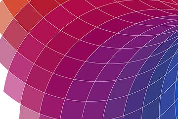
Purple relates to these feelings, concepts, and words:
- creativity, royalty, wealth, soothe, calm, beauty
- luxurious, wealthy, power, nobility, luxury, extravagance, dignity
- ambition, wisdom, independence
- mystery, and magic, pre-adolescent children
- light purple for romantic and nostalgic feelings, feminine, romance, mystery
- bright purple for children, youth
Coaching Niches Using Purple
Spiritual Coach: Uses purple to evoke a sense of spirituality and enlightenment, guiding clients toward deeper self-awareness and connection.
Creative Coach: Chooses purple for its association with imagination and originality, inspiring innovative thinking and artistic expression.
Leadership Coach: Purple signifies authority and vision, helping leaders develop their unique style and strategic influence.
Personal Development Coach: Incorporates purple to represent transformation and growth, encouraging clients to explore their potential and embrace change.
Entrepreneurial Coach: Uses purple to convey ambition and creativity, motivating clients to build visionary businesses and pursue bold goals.
6. Red for Passion and Power
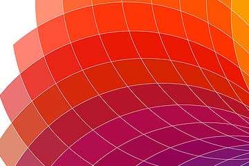
Red relates to these feelings, concepts, and words:
- fire, blood, energy, war, danger, strength, power, determination
- passion, desire, love, emotionally intense
- light red for joy, sexuality, sensitivity, and love
- pinkish reds for romance, love, friendship, feminine qualities, and passiveness
- dark red for vigor, willpower, leadership, courage
Coaching Niches with Red
Motivational Coaches
Red is a vibrant, energizing color that conveys passion and excitement, making it ideal for coaches who focus on inspiring and energizing their clients to achieve their goals.
Sports and Fitness Coaches
Red is associated with strength, power, and intensity, which makes it a great choice for coaches who work in the competitive and dynamic world of sports and fitness.
Sales and Performance Coaches
Red can symbolize urgency and action, making it appealing for coaches who help clients improve their sales skills or performance in high-pressure environments.
Entrepreneurship and Business Coaches
Coaches working with entrepreneurs may use red to signify boldness, confidence, and a pioneering spirit, encouraging clients to take risks and innovate.
Relationship and Dating Coaches
Red is often linked to love and passion, making it a suitable choice for coaches who help clients navigate relationships and build romantic connections.
7. White for Simplicity and Positivity
Using white in marketing materials can help these coaches project an image of purity, simplicity, and focus, aligning with their brand values and the transformative experiences they offer their clients.
White relates to these feelings, concepts, and words:
- light, goodness, innocence, purity, virginity, perfection
- safety, purity, cleanliness, positivity, faith, purity, coolness, cleanliness
- simplicity, high-tech products, charitable organizations, angels
- hospitals, doctors, sterility, medical, low-fat food, and dairy products
Health and Wellness Coaches
White conveys cleanliness and freshness, which aligns with promoting a healthy lifestyle and well-being.
Life Coaches
The color white can represent clarity and new beginnings, making it appealing for life coaches who focus on helping clients start fresh or gain new perspectives.
Mindfulness and Meditation Coaches
White evokes calmness and tranquility, which is suitable for coaches guiding clients toward inner peace and mindfulness.
Holistic and Spiritual Coaches
White symbolizes purity and enlightenment, resonating with coaches focusing on spiritual growth and holistic healing practices.
Organizational and Productivity Coaches
White suggests simplicity and order, which can attract clients looking to declutter and streamline their lives or work environments.
8. Black for Power and Strength
Black represents and evokes the following feelings:
- Authority, elegance, formality, intelligence, power, prestige, sophistication
Coaching Niches with Black
Executive Coach: Uses black to signify professionalism and sophistication, enhancing executive presence and leadership skills.
Career Coach: Chooses black for its association with authority and seriousness, helping clients navigate high-stakes career decisions with confidence.
Strategic Coach: Black represents clarity and focus, aiding clients in developing strategic plans and achieving complex goals.
Business Coach: Incorporates black to convey strength and reliability, supporting clients in building and scaling their businesses effectively.
Performance Coach: Uses black to symbolize determination and intensity, motivating clients to push their limits and achieve peak performance.
Coaches with a power or control vibe common with The Ruler brand archetype can make great use of black.
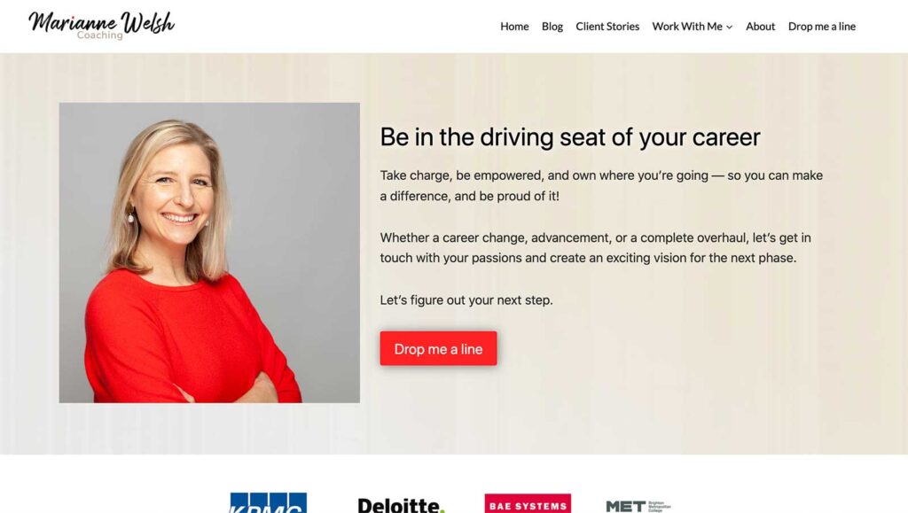
Example #3: Career Coach Website Colors for Wisdom and Passion
We chose the sage coaching brand archetype in a recent website design for a career coach in the UK, Marianne Welsh. It’s primarily grey/beige/gold with dashes of red to add a feeling of passion and energy.
Here are her home and blog pages:
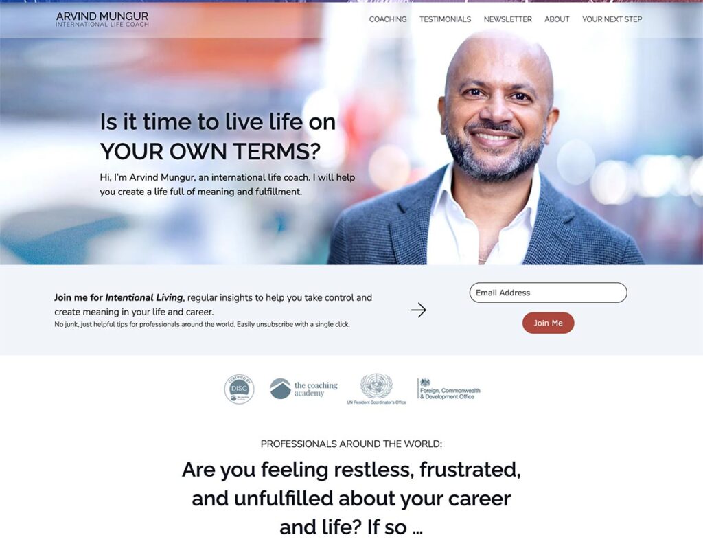
Example #2: Life Coach Colors for a
Calming Blue in Tough Times
For Arvind’s website, we chose a calming blue for trust when facing complicated, often emotionally charged situations. It works well for his diplomatic background and strengths in helping people navigate life’s storms.
Example #3: Yellow and Blue for Renewed Energy on Women’s Coach
On Lisa’s website, freshstart2life.com, her clients seek a new, exciting next adventure. We found this great image of a woman facing a new day and a sunrise. We chose to use bold, electric yellow, and blue in it.
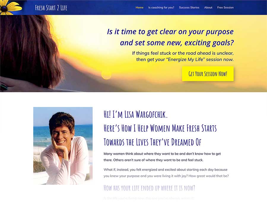
The rich dark blue, with a flowing energy of shades (gradients), complements the yellow for even more pow. Opposite colors are naturally pleasing to the eye.
I wrote a lot about visuals, images, color, and fonts in The Coaching Website Guide. So, if you’re planning a new site, working on, tweaking, or revamping one, get a copy to make it stunning.
Optimism and Hope for Susan’s ADHD Parent Coaching Website
Optimism and growth are two great words for parents and teachers of ADHD children. It can be challenging to handle children with special needs. Her clients need hope, and Susan Hughes, an ADHD parent coach, is the coach to deliver it.
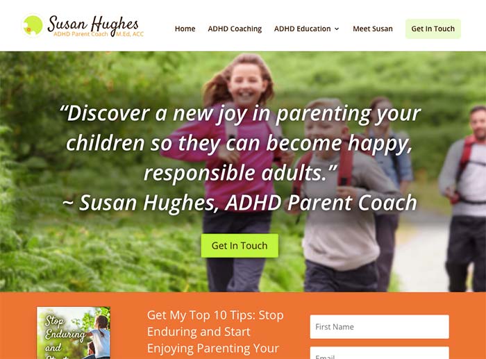
Enthusiasm, Optimism, and Hope.
Susan’s logo (ADHD Parent Coach in Perth), has a zesty green and orange circle graphic. I used imagery and colors to match the logo and create a fun, positive vibe.
That image of kids and parents is perfect. I tweaked the colors in Photoshop and extracted the right words to speak to frustrated parents desperately needing help.
I’m proud of how this one turned out.
A Common Color Problem: Templates, Logos, and Photos Don’t Match Up
The harder your website is to use, read, or look at, the lower the trust, and the faster people click away. On the flip side, the easier, more enjoyable, and more appealling a website is, the long they stick around. Everything impacts this experience — headings, menus, links, spacing, images, buttons, and all — AND COLORS!
For the majority of ugly coaching websites, the colors don’t work because a template was chosen that didn’t work with the other visual elements — the logo, the photo of the coach, the images used.
The answer is to to think about your visual vibe — your brand, your message, and visuals before building. Outline it all into something that makes sense and acutally inspires you.
When the visuals are off, you can sense it. Something feels off. If you don’t feel your website looks good, you’ll hesitate to share it, which will hurt your attempts to reach clients.
Related Questions on Website Colors
- Do colors really affect how people feel on my site?
Color psychology says yes. In my humble experience, it matters more that you don’t make a mess, and that the whole site feels good. I haven’t found that a certain color is so powerful that it makes me feel sad or energized or frisky, hehe. - How many colors should I use?
My take, is just figure out your main one and then just choose another used sparingly, subtly, or for highlights. Keep it simple and you won’t make a mess. - Can I just copy colors from another site I like?
Sure. But go for a site that has a similar kind of audience, niche, or brand as yours. Be warned that your logo and your images might not match up with them. If you use another site as a model, try to use a lot of what they are doing visually. - What’s a color palette, and do I need one?
The term simply means a bunch of colors in a group that go together well, as already determined by designers. These often have 4,5 or more colors, which will likely confuse the newbie. So, I do recommend just aiming for one main color to use consistently, and an optional one sparingly.
Which colors do you like? Tell me below.
I love hearing from coaches in the heat of growing their businesses.
Tell me what colors you’ve chosen or are thinking about below.
Smartly chosen colors on your coaching websites will emanate those positive vibes that clients love.
So, think about your color scheme, visual elements, and tone of voice — and align those with how you want people to feel on your website.
Ever experimented with color schemes for your website? What colors are you most drawn to, and what feelings do they stir up?
I’d love to hear your comments.
Considering purple and orange. Would love your feedback.
Hi Debra … tell me about the look and feel you want for your website. Tell me more about your business and I’ll give you feedback.
I am fond of the color green & I do have several pictures taken outside on my website. I wouldn’t say that my website is green though. It’s more of a rainbow although the color is used judiciously. This is definitely not my area of expertise. All I know is that it seems to work & I’m glad I got your help with it.
On a “feeling” level, we’ve got the words energy, positivity — which aligns with your approach, beliefs, messaging. Good words and phrases can help glue the visuals together.
Hi I’m trying to figure out my 3 best colors to do for my website. I’m an upcoming author, speaker and Transformational Life Coach. I was thinking yellow, bright orange and fog grey. What do you think? And what do you suggest? I’m a lighter shade of brown skin mixed lady. Website not done yet
One way to do it is get a great photo of you for the homepage, then seek colors within that image.
Often your outfit will refelct colors that look good with your complection — and then consider the feeling you want your site to give off.
3 colors? That can be very hard. How about one main one, use it often, and maybe 1 or 2 other color touches here and there?
Thank you for this, I am a chef that is moving in the space of health coach. I created a weight loss program and incorporated turquoise and orange with pops of purple (in the actual ebook) and am thinking about repurposing those colors for my coaching website. Not sure….
Thank you Kenn, very interesting!
You’re welcome Sara. Got your domain name yet? Or still figure it out?
I found this super interesting, thank you.
So what colours would you use for a company providing services in coaching, mentoring and thetahealing (meditational practice) with the niche for coaching and mentoring: women in tech
Thanks Edina.
Who is the most ideal/best/desired client if you had to pick one?
Their goals, outcomes, dreams, needs?
I’m also curious about the brand archetype that could/would suit.
See this post on brand archetypes for coaches.
YES! This is my greatest chore when establishing a website for my business. It’s often the first IMPRESSION of your business, you, and feelings you emit to potential clients.
I am a energetic, funny, creative minded person. I’m struggling with the application of colors and tone of my website because I want to “niche: in on men who are tired of themselves 😳😱.
I like challenges lol.
Anyway I need to create a professional, exciting and distinctive design and my favorite colors are blues, greens and purple… deep – contrasting pale.
I like the calm, soothing and pop of these colors.
I used bright blues and greens for my last pettaxi business website. I feel like it was welcoming, friendly cheerful.
Yes, energetic, fun vibe!
Thinking about those men is a good move.
Got a site address/draft? Feel free to post it, even if it’s in the works.
Kenn,
Like you I like black clothes, wear too, a lot of while and blue.
Bright colours can make people feel good, just the same as a sunny day, make you feel alive, cheerful and more
motivated in getting things done and enjoying the day.
Colour needs to blend into the website, pages and can make people wish to continue reading.
A very interesting read about colour and what they represent. This will interest many people.
Wow, Kenn for this beautiful article. This is really great & informative. Colors make life cheerful. The concept of colors is really great & impressive. Thanks for the concept.
It is a fact that colors stand for certain ideas and elicit definite emotions. One should use this to its fullest advantage.
Kenn, I recently (just last month) relaunched my website. It went from a bright green to a dark blue. One of the very first comments I received from a colleague was “Much more professional!”
I can see from your list that I’ve hit the exact target I was aiming for! I’ll probably print this list out as it’s good for product covers too. 🙂
Kenn,
I am running an ad on New York Craigslist for artists to exhibit their art at my gallery under community/artists and since I filled the background with a solid fully saturated color my response results have been incredible. Prior to doing this my response rate was maybe 1 for the entire running of ad.