6 Sweet Styling Tips for Easy Engaging Emails
Once you’ve learned how to write kick-butt blogs or awesome articles or even super sales scripts, and started sending them out to your list, you’ll want to start tracking the numbers behind those emails to see who is responding or reading.
A little surprise you’re likely to face is that a large percentage of your emails go unopened, unread, or otherwise ignored.
And while a crappy headline is the biggest reason, a tough-to-read email comes next.
So, if you do work hard to write a winner and carefully craft catchy subject line, then your next order of business is to make sure the formatting and style are optimal for reading.
Below are 6 tips to make sure your emails read easy plus 2 videos of how to do it well on AWeber.
1. Use a short width
Make your emails 60-70 characters wide.
Short widths don’t need much eye or head movement to read – it’s easy.
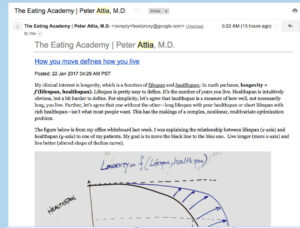
Here’s an email from a guy I like, Peter Attia, but it’s a bit rough to read because it’s wide, coupled with a smallish font.
Click to view image (you may need to zoom in too)
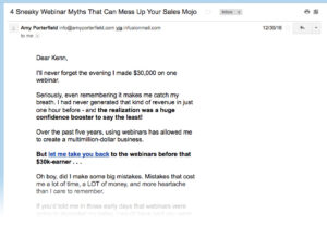
Here’s another email from another guru, Amy Porterfield, who uses a shorter width with a bigger font, also with shorter paragraphs.
Click to view email (you may need to zoom in too)
Easier?
2. Keep formatting simple
Email list managing services like AWeber or MailChimp give you the option to create emails in plain text format or HTML format.
I recommend sticking to plain text for newbie coaches because …
- People like simple looking emails – which are mostly text.
- HTML emails are harder to format and get messy.
- Friends send emails that are text – and you want your subscribers to feel like your friend.
- You are more likely to write and send emails to your list if it’s easy.
If you’ve been at the email marketing game a while, go ahead and use HTML, but keep it ultra simple. To do that …
- Avoid multi-column layouts
- Avoid too many images, fonts, and colors
- Keep it looking like a text email with the occasional bolding, italicizing or image
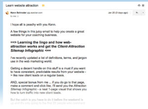
Here’s a recent email from one of my gurus, Yaro Starak and how his email looks in my Gmail inbox.
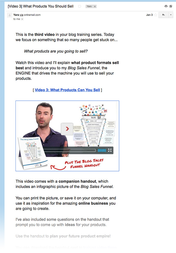
It’s very simply laid out, in a one-column format, with a short width, and nice big, easy-to-read font. Excellent!
3. Make sure it’s mobile ready
When you write your emails, be sure to check how they look on your mobile device.
Simply send yourself a test and hop onto your smart phone and have a look.
I’ve completely goofed up my emails many times and it’s easy to just assume it will work on mobile devices.
4. Check Gmail, Hotmail (outlook/msn) and Yahoo
While you’re at it, you should set up accounts at each of Gmail, Yahoo and Outlook (hotmail) as they are among the most commonly used applications (it’s super easy and fast to do).
Then, when you test your emails, send it to those places as well.
You’ll likely be surprised at how your emails look different than intended.
And if you find any hiccups, try simplifying your emails to resolve.
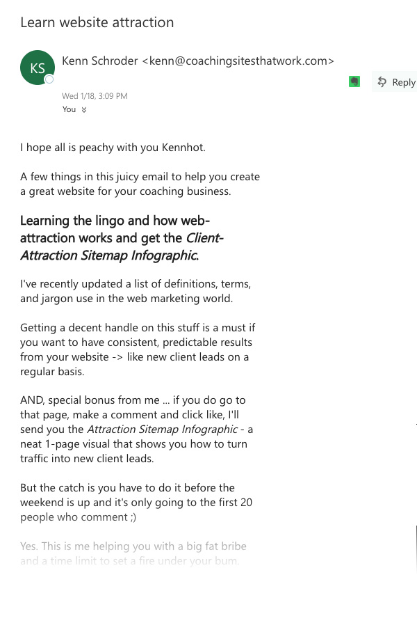
After tweaking (per the videos below), here’s how one of my recent emails appeared in these three email programs:
In Gmail …

In Yahoo …
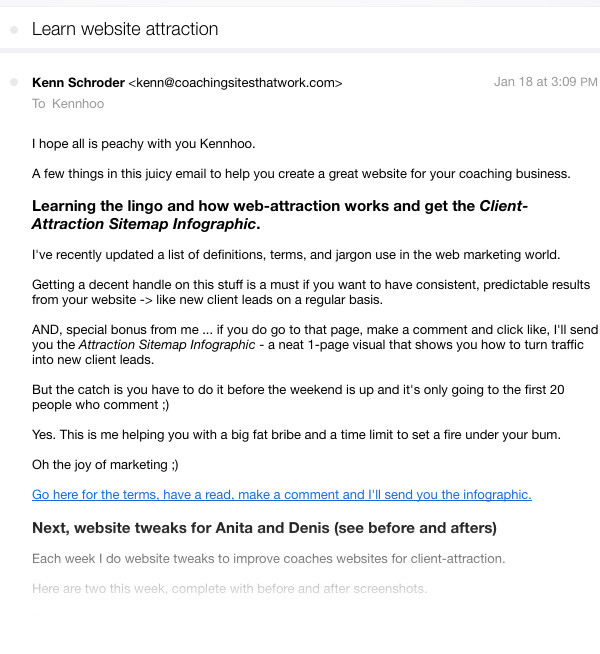
In Outlook …
In the videos below, we’ll take a closer look.
5. Bump up the font
For most email programs, the default font size is on the smaller size.
A simple bump up of the font 1 or 2 points will resolve the issue.
In the video way down below, I will show you how to do this with AWeber.
Here’s a screenshot of a recent email I sent to my list for which I increased the font just a bit.
6. Test your email before sending
ALWAYS send yourself a test email before sending out to your list.
Give it a quick read, test the links, and make sure it looks good on your mobile and in your additional accounts from #4 above.
Here’s a simple set of scenarios to test …
- Gmail account on your laptop
- Gmail account on your mobile
- Yahoo account on laptop
- Yahoo account on mobile
- Outlook (hotmail) account on laptop
- Outlook (hotmail) account on mobile
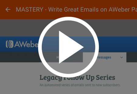
And here are 2 videos, Writing Great Emails on AWeber
Here are two videos of me formatting and testing emails using AWeber and looking at them in Gmail, Yahoo and Outlook (via a Hotmail account).
Write Great Emails on AWeber Part 1 of 2
Write Great Emails on AWeber Part 2 of 2
In summary …
Remember, while great content in your emails will win your reader’s hearts, an easy-to-read format will win their eyes. Use a shorter width, keep the layout simple and test your emails before sending them out.
Love to hear from you. Post below.
[fblike]

Good solid advice Kenn.
Helpful post. Thanks Ken.