Nike’s Shoe Customizer – Visual Design Tip for Your Website
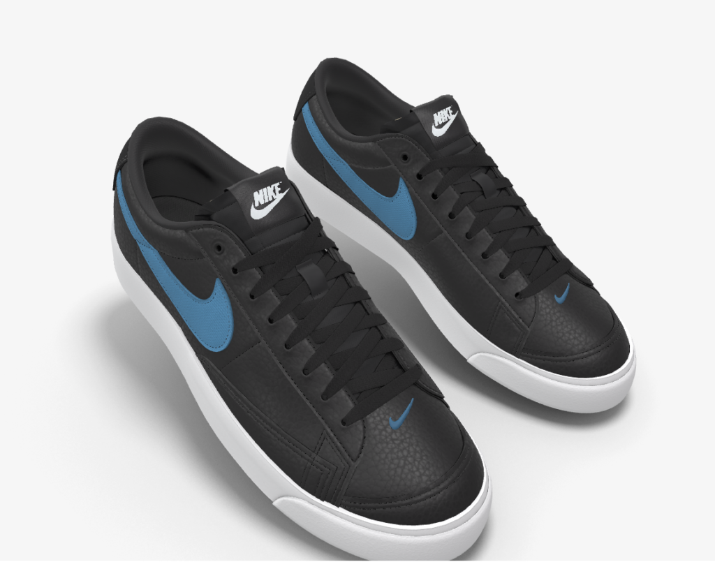
WONDERFUL!!! That’s show I’d describe how smooth, sweet, and fun the “make your own sneaker” customizer is at Nike. I just stumbled upon it, and made a pair of these, which now I want so badly ;P
I don’t expect for you to fall in love with these (but if you do, we’ve got a similar style). And if you don’t immediately love them, well, there’s a good marketing lesson here.

I already know my wardrobe, the colors that work well on me. I also know my personal style for fashion, comfort, and joy. So it wasn’t too hard to create these sneakers.
When it comes to your coaching website, knowing your coaching brand archetype as well as who your ideal client are will help direct you on the visual elements of your site.
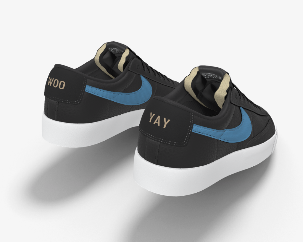
You can even add text to the back. Here’s what I did:

Try out Nike’s thingie, here:
Customize Your Nike Blazer’s here.
How smooth and fun was that? I’d love to know.
If you felt all over the place in making your shoes, taking a closer look at (1) your target market and well as (2) the aura you want to give off can help.
Do a little soul searching, get clear about you and your best clients. Everyone will be better off for it 😉

