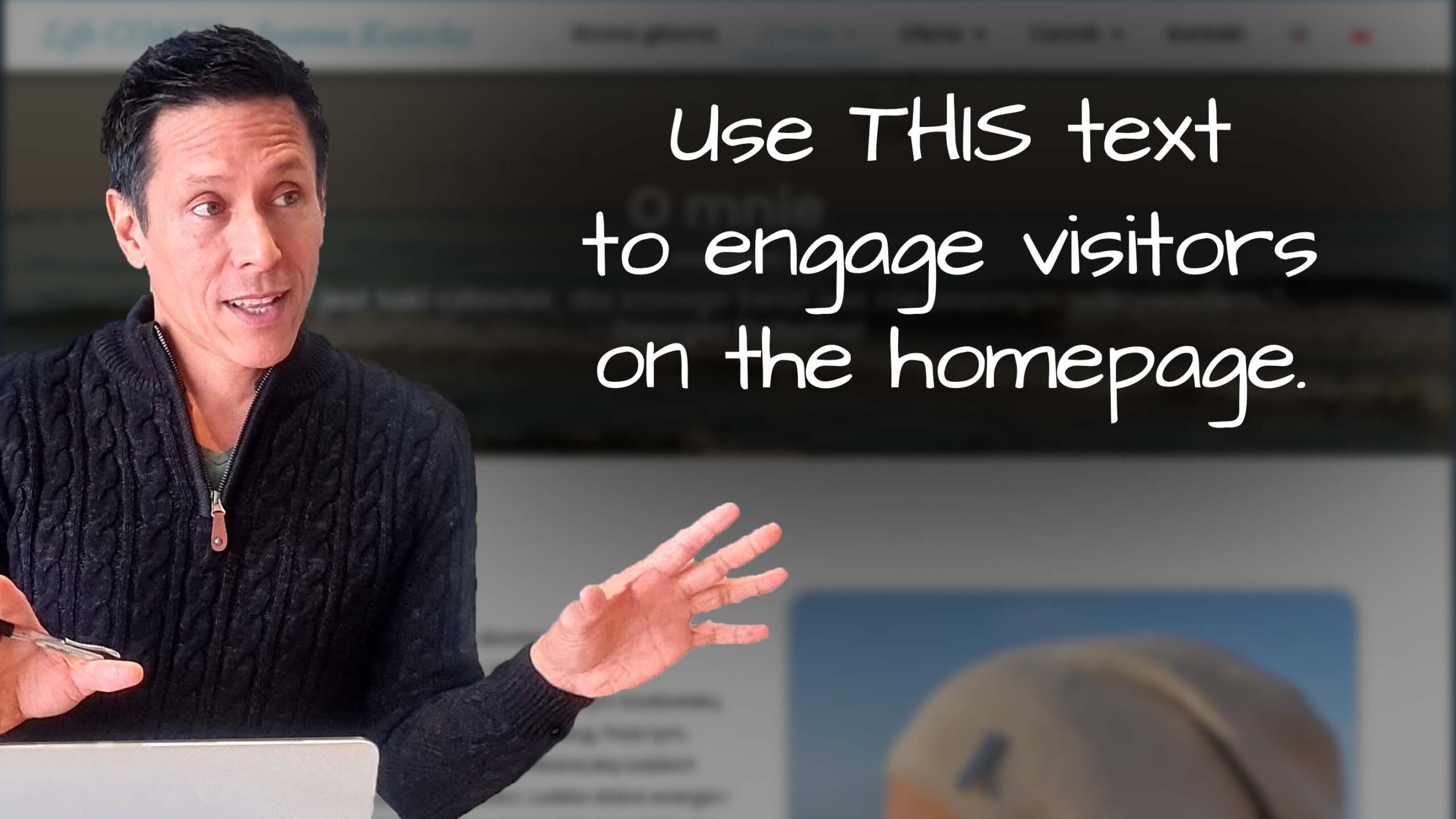
Use This text to engage visitors on the homepage
I review Joanna’s life coaching website and share tips to improve it.
I like the use of blue, the obviously positioned and easy to understand the menu and the mountain/nature imagery (nice!).
I make suggestions for:
* Homepage text to engage visitors
* A potential speed issue with the video
* Tips to help get more contacts
* Security issues that’ll turn people off
Want me to review your website? Just comment below to give me your link, and I’ll add it to my list.