Coaching Website Tweak for AnnaLaura
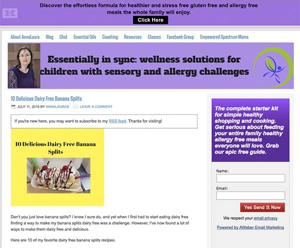
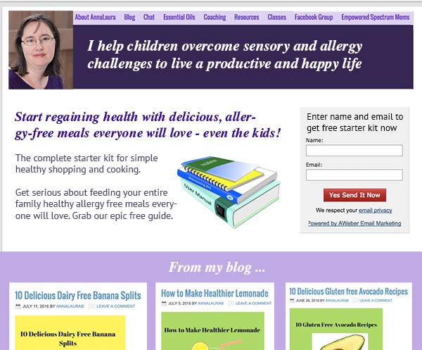
To improve AnnaLaura Brown’s health coaching website for client-attraction, here are before-and-after images along with my suggested tweak.
If you want me to review your coaching website schedule some quality time with me here and we’ll find high-impact yet easy-to-do enhancements to improve your website for client-attraction.
Before screenshot …

My suggested tweak for client-attraction …
I love that your face is on the home, you’ve got a big tagline and you’ve got a freebie available for those who join your list. Awesome marketing elements!
To me, your home page feels jumbly, scattery – like a scrap book because the elements aren’t in a cohesive design. You’re prime for a fresh theme or layout which is easy with WordPress.
In the after screenshot below, I’ll both highlight your message more clearly while urging people get onto your email list (which is a smart move because it allows the relationship to grow).
After screenshot …

Does this spark any reactions, thoughts, ideas or suggestions? Let’s hear it! Post below. 😉


I really like the banner changes and have already changed the text as well as the home page text. I’m currently using lifestyle child theme with genesis and I don’t believe I have the option to put the blog posts down below. Any ideas of a theme that would let me do that?
Plenty of themes let you organize blogs all kinds of ways. Genesis probably has something there as well. I’d ask their support team, showing them my image above.