Before and After for Ashley
Here’s a website before and after for coach Ashley Smith. If you want me to review your coaching website then schedule some quality time with me here and we’ll find high-impact yet easy-to-do enhancements to improve your website for client-attraction.
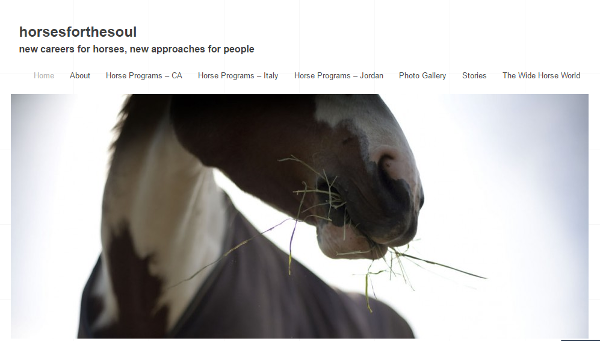
Here’s the before screenshot …

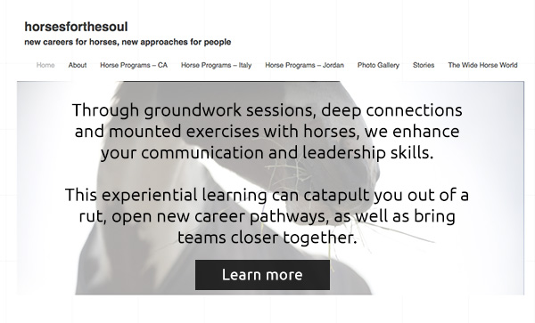
Here’s my suggested tweak …
Lovely horse pics! And I love the white space.
The biggest thing I’d do with your site is make it clear what it’s about. I have no clue! It mentions careers for horses but that just sounds odd.
You’ve done what many coaches do – bury your best content on the about page when it should be at the top of your home page.
“What we offer people, through groundwork sessions and programs including mounted exercises, is effective management of energy and a connection to soul and spirit through horses and the natural world. New insight. New habits. New life. New paradigm.”
Though I’d tighten that up into a powerful, short statement.
Here’s the after …

I’d love to hear your thoughts, just post below.


That was my first reaction as well, Bill. When I see faces blurred or eyes concealed, I wonder, “Why is the identity being hidden?”
OTOH, putting the answer to my question of, “So what … what’s in it for me?” front and center makes me want to read on rather than move on.
I like the change ( for the better ).
Pity the head shot of the horse doesn’t include an eye.