Before and After Coaching Website Tip – Shari
Thanks, Shari for sharing your coaching website on Linkedin. If you want yours reviewed, find me on LinkedIn and post your site.
If you’d rather not wait, then schedule some quality time with me here, and we’ll find high-impact yet easy-to-do enhancements to improve your website for client attraction.
Shari’s site is here: www.sharirozansky.com.
Here’s your website BEFORE screenshot:
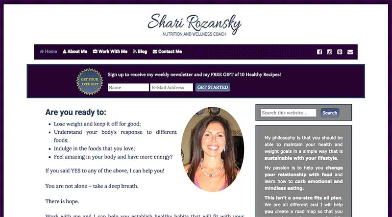
You’ve got a killer smile. Instant likability bonus points right away. Great!
If you are getting a new photo sometime, the flash is a bit strong and it washes out your face, hiding that warm healthy glow.
You’ll want to avoid that.
I recommend getting outside on a cloudy day or just making sure you’re away from direct sunlight.
Nature in the background is super as it breathes life into everything. It’s great for health coaches especially.
I really love the “are you ready to …” bit but I’d pull the bullets into the text and make it much bigger.
The headline is a great place for visitors to start and get excited about being at your site.
The WHY they should be at your site infinitely dwarfs a cool logo. Make the WHY big.
Also, you’ve got two good features: The “email list invite” and “work with me” invite.
I’d sell them more however to get people to take you up on them. Make it an amazing offer. Sell it.
Here’s my AFTER screenshot with the headline tip:
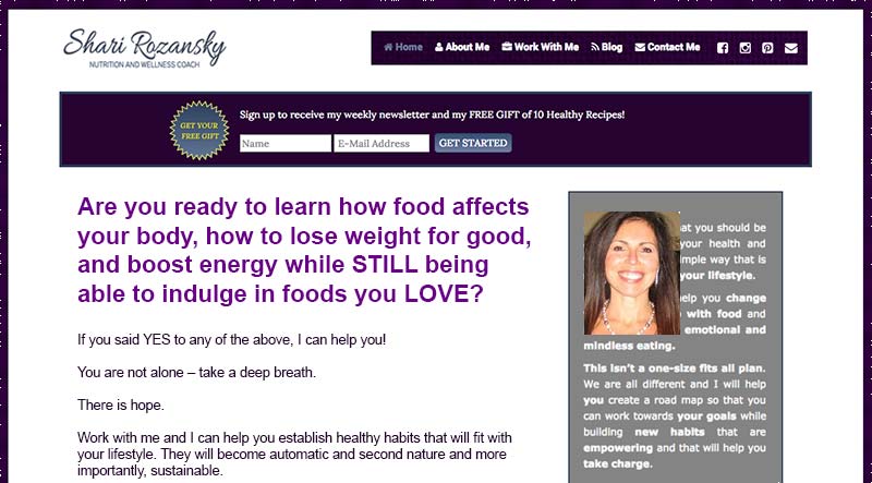
See how it grabs?
Comments and thoughts are welcome.