Site Review for Brenda Sissoko
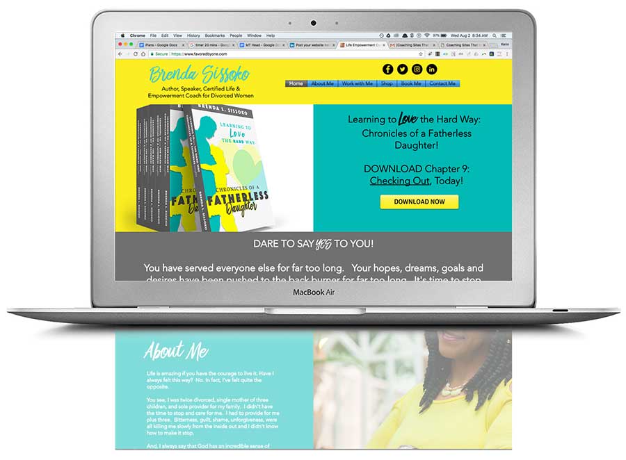
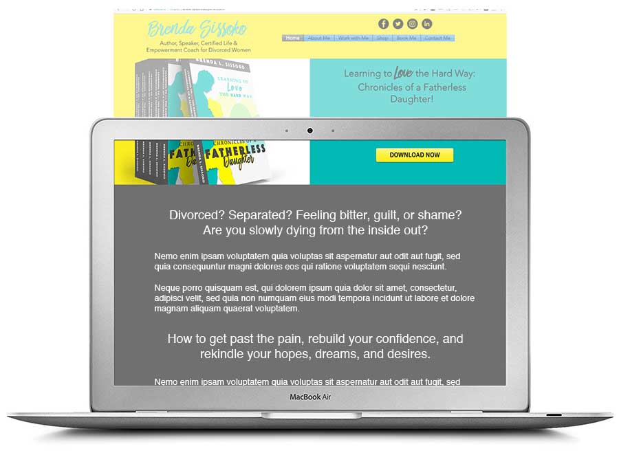
Below is the before and after image for life and empowerment coach Brenda Sissoko’s website. Thanks for sharing it Brenda.
For others who want a quick eye on your website, you can post yours (for free) to The Coaches Support Group on LinkedIn. Managed by my homie EG Sebastian. Feel free to tell him I sent you for free coffee.
If you want to find the best ways to turn your stuck website into a lead-generating monster, then book some quality time with me.
Onto the review …
Here’s the before image …

Here’s what I like …
I love the colors and energy on the page. Your voice goes well along with it. I feel like you’re a dynamic, positive person. That’s great!
The logo and tagline are located in a great spot, top and left. That makes me feel good about getting around your website. I feel it will be simple.
The tagline helps me know what you do. Also good to have so that visitors immediately get that you offer advice, coaching, support.
I like the font size and choice. It’s big and very easy to read.
The small paragraph sizes are also good for reading. Nicely done.
The free chapter giveaway. That’s smooth move for getting list subscribers. Super.
Here’s what I suggest to make your website sell coaching better …
What I’d suggest, to help you engage your ideal client, is take that grey area where it says “Dare to Say Yes to You!” and add content there that speaks more deeply to the situation they are facing.
I’m estimating that those women are feeling some tough pains, self doubt, that things might be hopeless and even some form of self-hatred for where are. Anger and all sorts of stuff – which you’ll know better about than me.
And while I don’t recommend making your website a miserable place or highly negative, I do think that copy around the struggles and pains will show women that you get them.
I know many coaches want to “stay positive” and avoid any talk about the reality of the pains. But clients are also drawn to people who get them, their situation and struggles. I’d not be afraid to talk about the pains.
So, I’d take that grey area and talk about the struggles of divorce, the feelings and thoughts, the impact. Give some hope for change, some advice (you seem to be all about self-care), and speak about the possible future of feeling confident and full of love or if the desired future state for them is simply getting back to normal, getting back to being steady and at peace – then speak to that.
I’ll have to defer to your experience about the situation they face, the pains/struggles as I’m not a woman (last I checked hehe) and also haven’t been divorced.
Here’s the after screenshot, showing how I’d tweak that grey area to get your ideal client to want to book with you …

A few other things I noticed …
1. The site isn’t coming out right on mobile. The Download Now button gets lost on the right.
2. Your “book me” page (awesome that it’s in the menu) is an image, probably from a brochure. I’d make that into browser-detectable text.
3. The “book me” button at the bottom of the page goes to the contact page. That’s confusing. I’d make it go to some sort of calendar scheduler (paid or not) OR an email request to schedule time with you. Make it clear what will happen and how to book you.
Again, love vibe you have as well as the simple layout. The focus of women after divorce is also a good move for marketing.
Are you finding this helpful?
Wuddya think? Share your thoughts below.

