Before and After for Brian
Here’s a website before and after for business coach Brian Lucas. If you want your website looked at for a quick tweak to improve it, schedule some quality time with me here and we’ll find high-impact yet easy-to-do enhancements to improve your website for client-attraction.
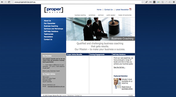
Here’s the before …

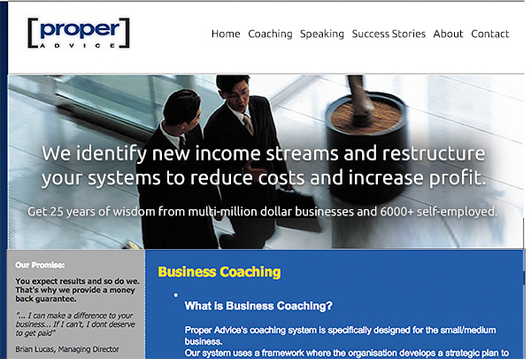
Here’s my suggested tweak
Business coaching. Great. I love the colors for this and the image. They suit.
Dated … when a site feels dated, that’s a bad thing. And, your site feels like that because the newsletter is from 2010, the copyright 2007, the “coming soon” content that never came, and the tiny font and tiny width which don’t work anymore. Also the multiple menus and left menu are unnecessary and also dated. A simple row across the top will do – think minimal.
I recommend a refreshed layout, bigger font size and ditch the “coming soon” stuff unless there’s a date on it. 😉
I like this “Our team has over 25 years experience in running multi-million dollar businesses and can draw on the experiences of over 6000 self-employed people …” and would put that on the home instead of about page.
Here’s the after …

I’d love to hear your thoughts, just post below.


Kenn… Probably the biggest positive tweak I’ve seen you do. Excellent
Yeah … a big, juicy headline. They are, for most coaching sites I’ve seen, the biggest room for improvement.