Website Tweak for Cathy Norris – Get Above the Fold and Be Bold
To improve Cathy Norris’ coaching website for engaging visitors quickly, here are before-and-after images along with my suggested tweak.
If you want me to review your coaching website schedule some quality time with me here and we’ll find high-impact yet easy-to-do enhancements to improve your website for client-attraction.
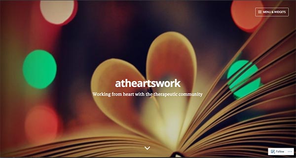
Here’s the before screenshot …

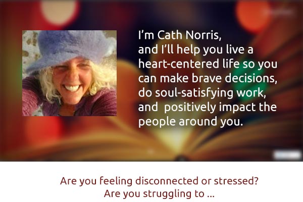
Here’s how I’d improve it …
I really like the vibrant colors of the image on your home page. It’s energetic.
What I’d do to improve this page is get some juicy content “above the fold”. This is the first thing people see without scrolling.
As it stands now, there’s nothing there and I’d just leave. Maybe I’d scroll down to have a peek. Maybe.
Remember, you only have seconds to engage people and get your message across, else they bounce.
Here’s the after screenshot …

Any ideas coming to mind? Be brave and share them in the comments.
[fblike]

