Site Review – Colette
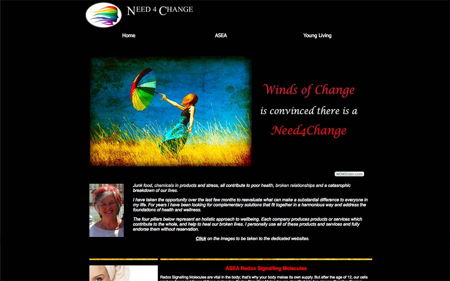
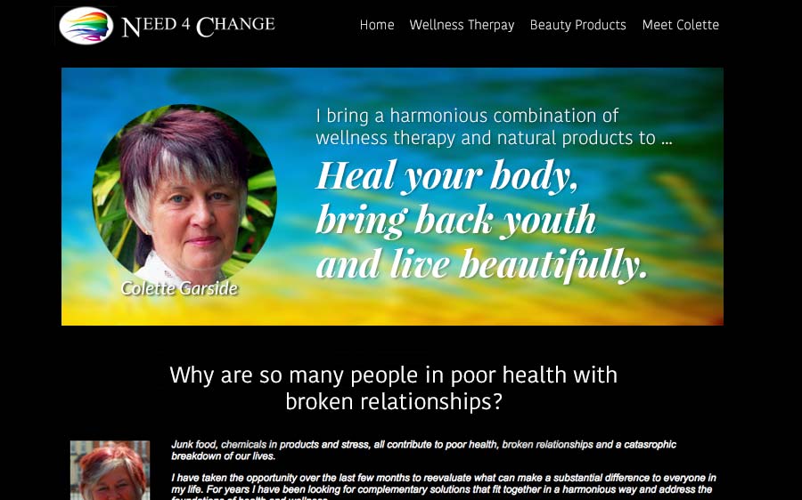
Below is the before and after image for coach Colette Garside’s websites namely: windsofchange.eu.com, need4change.com and need4change.teamasea.com. Thanks for sharing it Colette.
For others who want me to have a look at your website, then post it for free at The Coaches Support Group on LinkedIn (you will have to log in first for the link to work).
It’s managed by my homie EG Sebastian, client-attraction mentor. Tell him I sent you for free donuts and coffee or organic chia, coconut, cacao, berry pudding and loose-leaf tea.
If you want an in-depth, personal, deep look at your website and find the best ways to turn it into a lead-generating monster, then book some quality time with me here.
Onto the review …
Here’s the before image …

My Suggestions to Improve Your Websites …
I like that you’ve taken lots of action to get your sites up to help you grow your business(es?).
It’s also great that you’ve written books and gotten them online for purchase. Nice work.
The biggest thing that jumps out to me for improvement is to eliminate confusion.
In looking at the three websites, It’s hard for me to figure out what they are and what their purposes are.
People won’t stick around if it’s not clear within seconds of arriving.
Some specific areas of confusion …
1. LinkedIn Mismatch
After a quick look at your LinkedIn profile, I see your profile tagline is “Experienced in Health & Wellness to feel and look younger easily” but when I land on your websites, within seconds, I don’t get that kind of message.
I recommend you get “look and feel younger easily” onto the top of the home page of your websites – or at least your main website.
2. What is ASEA?
I would not assume your visitors will know that ASEA are safe, organic beauty products.
I had to look deep into your website to figure out what ASEA was. Normally, I wouldn’t do, and people won’t do either (confusion doesn’t spark curiosity, it just makes people leave).
I would, at the top of your home page, put some words stating “safe, organic, health and beauty products to make you feel and look younger in minutes.”
3. Make it clear what each website is for.
After a lot of work, I’ve come to guess that your three sites are for (1) selling products (2) selling courses and (3) selling coaching.
I’d make it clearer with headlines and taglines so that I know what each site is for.
Below are before and after images for the Need 4 Change website in which I’ve brought a few key elements from each of your other websites.
Granted, my suggestion is just based on a quick look over your website. A proper recommendation would come from sitting with you about what is actually happening with your websites, what your intentions are – a good look at your stuff.
4. Put your name on your website.
I keep seeing references to “Winds of Change” as the entity of the website.
I don’t see your name much.
I’d not hide or stay recessive on your website, but instead, bring your face to the front page. Be the spokesperson for your business.
Put your name everywhere your photo appears.
Be visible, vocal, and proud of it.
Visitors can better relate to a human being, the founder, the coach, the passion. Also, content is much exciting to read if it comes from a real person.
And if you are coaching people or teaching courses or advising in any way, people need to connect to you (real you) on your website.
Here’s the After Image

 Wuddya think? Share your thoughts below.
[fblike]


Great!
Glad it’s given you some ideas.
A crisp clear message is a good move. Make it easy and enticing for people to engage with your websites and you’ll get more sales, leads, clients, students, etc.
There are often simple, swift ways to improve. A closer look at your marketing activities, website traffic, pages views along with tried-n-true conversion techniques often results in big shifts.
Thanks for sharing your site.
Hi Kenn,
Thank you for taking a look at my websites. They have evolved over time and through that have clearly lost a crisp clear message. In that respect I really appreciate your comments and will take a fresh look at each of them and maybe reduce from 3 down to one. Thanks again,
Colette