Simply Engage – A Website Tweak for Ellen
To improve Ellen Kocher’s health coaching website for engaging visitors quickly, here are before-and-after images along with my suggested tweak.
Engaging your visitors right away is the move to make. Below are before-and-after images to help Ellen’s website get people to eagerly want to read her content.
If you want me to have a look at your coaching website you can schedule some quality time with me here and we’ll find great ideas to improve your website for client-attraction.
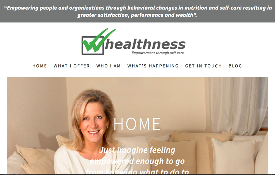
Here’s the before screenshot …

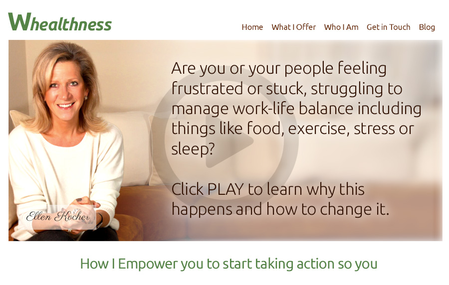
My suggested tweak …
I like your photo. You’ve got a nice, pleasant, professional image.
I also like that your content is focused on the client and their interests.
Also, you’ve got some videos there. Nice work.
The biggest thing I’d do is simplify the layout so that the most powerful content is prominent and visible without any scrolling. As it stands now, your logo takes center stage along with your face.
Also, I’d redo that logo. It’s confusing with the double check marks being a W? I wasn’t sure it was a logo at first.
Here’s the after screenshot …

Any ideas coming to mind? Be brave and share them in the comments.
[fblike]

