Coaching Website Tweak for Life Coach Ginger to Grow Her List
I’ve been reviewing coaching websites on LinkedIn. If you want yours reviewed, find me on LinkedIn and post your site. If you’d rather not wait, then schedule some quality time with me here, and we’ll find high-impact yet easy-to-do enhancements to improve your website for client attraction.
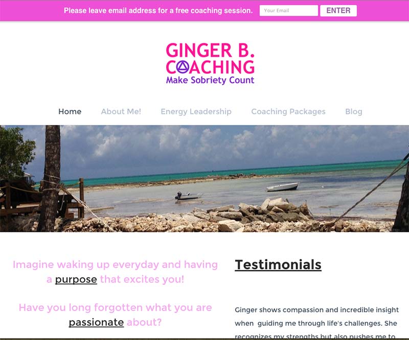
This website tweak is for recovery and life coach Ginger at http://www.gingerbcoaching.com.
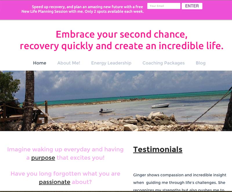
The biggest thing I’d do is get a benefit-rich headline or tagline that is big, front, center, and dominant.
People need a WHY to stick around and explore your site.
Paint the dream life as a result of “making sobriety count” and put that into the headline.
Also, ditch the exclamation point in the “About me!” menu.
People add exclamation points to try to make something sound more important.
Exclamation points should go where they make sense, like, “Help!” or “Damn!” or “OMG!”
To be a little different than other site reviews, I’ll help you get more people onto your email list.
Here’s your BEFORE:

and AFTER:

Does this help?
Once you’ve done up your headline and email invitation, be sure that you’re:
* getting visible where the best kinds of clients hang out
* building trust with your list
* making a super-juicy coaching offer they just have to say yes to, or they’d know they were making a huge mistake by not working with you.
