Site Review for Marwin
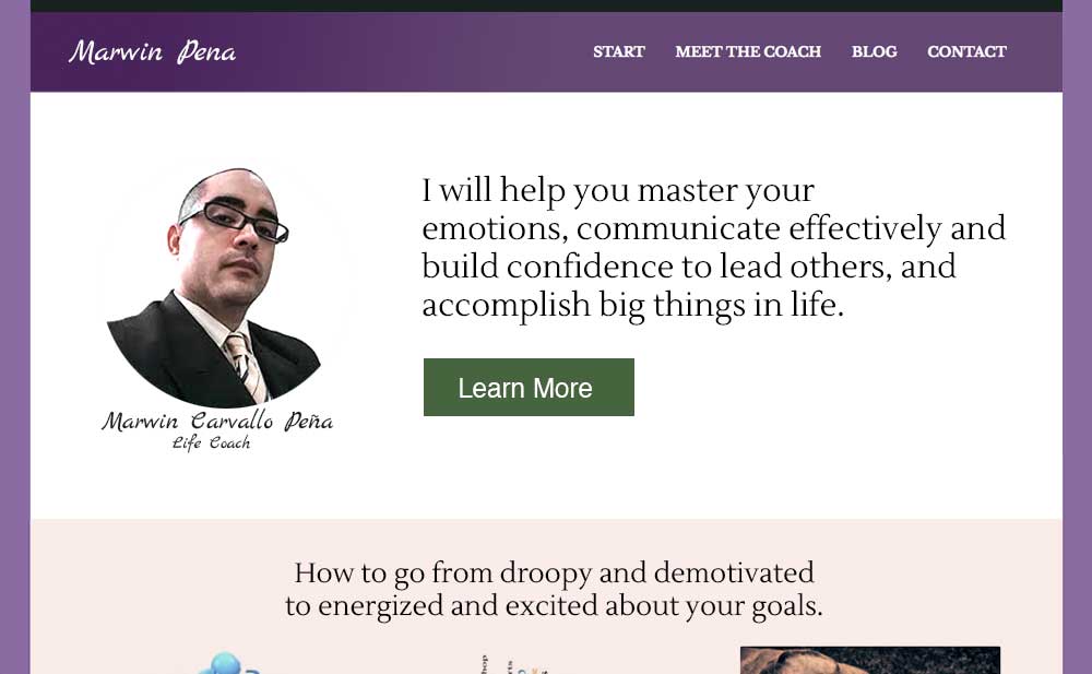
Below is the before and after image for life and empowerment coach Marwin Carvallo Peña’s website. Thanks for sharing it Marwin.
For others who want me to have a look at your website, then post it for free at The Coaches Support Group on LinkedIn (you will have to log in first for the link to work).
It’s managed by my homie EG Sebastian, client-attraction mentor. Tell him I sent you for free donuts and coffee or organic chia, coconut, cacao, berry pudding and loose-leaf tea.
If you want an in-depth, personal, deep look at your website and find the best ways to turn it into a lead-generating monster, then book some quality time with me here.
Onto the review …
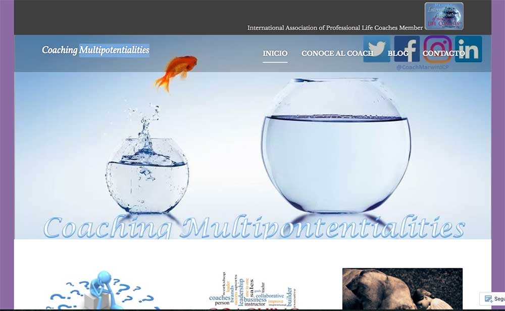
Here’s the before image …

Here’s my feedback …
Marwin, thanks for sharing your website for review.
It’s a good thing I can read a little Spanish 😉
I like that your menu is clearly located at the top right. It’s easy for me to find. It makes me feel good to explore your website without getting lost.
I also like that you have your IAPLC logo for credibility. Great move.
To improve your website …
1. Remove the big fish image.
Replace the big fish with words that tell WHY your visitors should be at your website.
Instead, talk about the pains and desires your visitors can gain from coaching.
Remember, clients want to know WHAT they can get by being at your website. Without a good reason to read your website, they won’t. They will just leave. You miss out on new possible clients.
2. Remove the word “multipotentialities”.
I would not use that word unless your ideal client knows what that means. I’m guessing that they don’t.
I know many coaches love their conceptual words and made-up phrases to express a special notion or concept. But sadly, these things just confuse clients who don’t know the terms and make it harder for them to understand what you do.
Website should be written “from the client’s perspective” so they can quickly and easily and excitedly learn about what you do.
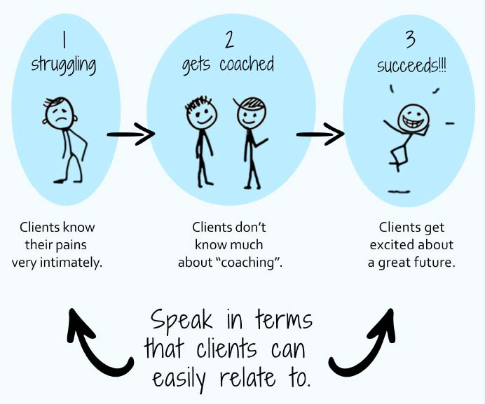
I wrote about how to do this in The Coaching Site Guide, which has a great visual diagram called The Language that Client’s Speak, which I’ve shown here:

Congrats on getting your website up, that’s often a big feat in and of itself for many.
3. Fix up some layout issues.
The menu is overlapping the social icons.
In a mobile device, the main section (fish image) gets cut off (if you keep the fish image).
The IAPLC logo is small and blurry. Make it bigger and sharpen it up. I’d put it in the footer or the About Me page.
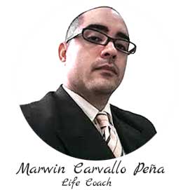
4. Get your face up front and center.
People love seeing who the coach is behind the website. Get your face visible so people can connect with you.

Again, I think you have a good, simple website layout with a well positioned menu.
I would first focus on the content, get it to speak to your ideal kind of client, and get those words immediately at the top of the home page.
You may want to sit with a few past clients and ask them what they’d say about what you do. It will help you find good words that they’ll love.
Wuddya think? Share your thoughts below.
[fblike]

