Midlife Life Coaching Website Design – Feminine, Warm, Powerful
I’m reviewing a dozen websites of coaches (executive, business, leadership) in my little stash of Nice Sites collected over the years. This one is Megan Dalla Camina’s life coaching website with a “feminine, warm, and powerful” style.
In this blog post:
- A quick look at the design
- My thoughts in a video review
- Three design tips from the video
What do you think of the design?
Post in the comments below.
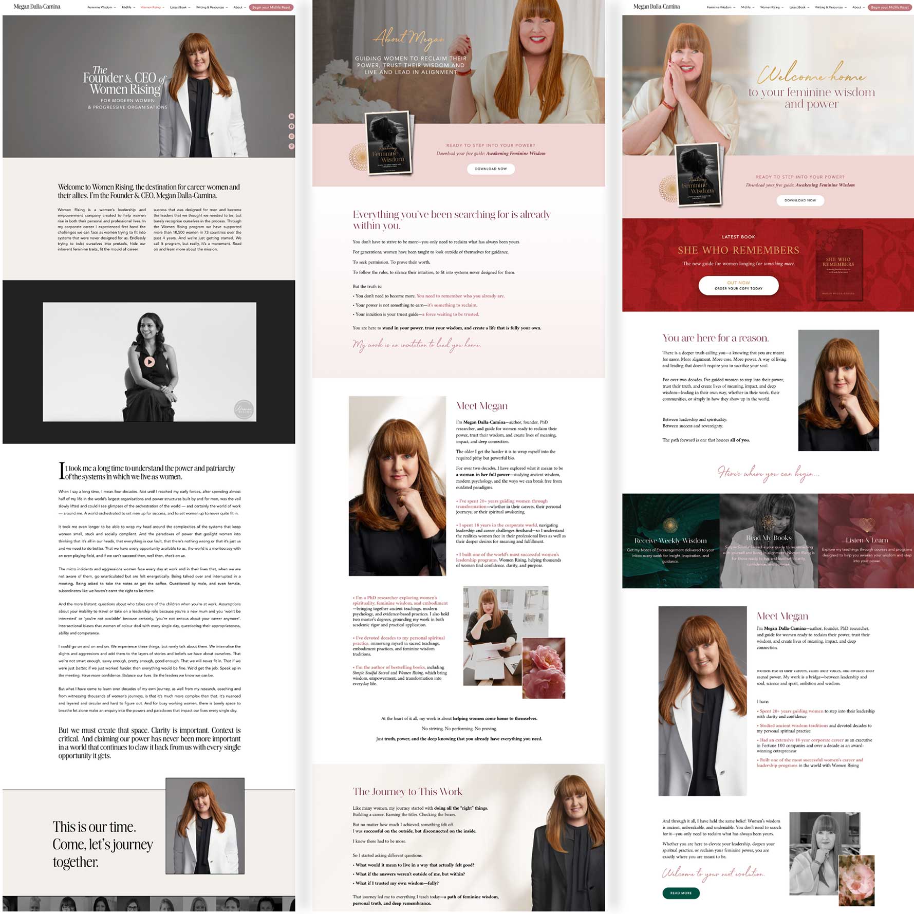
A screenshot for a quick look …

Feminine, Warm, and Powerful Website Design (from megandallacamina.com)
Like it? I’d love to hear what you think in the comments section.
My Video Review for Design Ideas, Content Creation, and Tech Tips
In this review, I walk through what makes the brand feel so pulled together, where the site starts to create a little hesitation, and one technical issue that can quietly cost her. I also get into a bigger point: a good coaching website should feel like the coach, speak clearly to the right person, and make the next step easy to take.
Full video on YouTube, here: Business Coach Website Design for Fresh Ideas.
My three favorite things to say about websites from looking at Megan’s site …
Simple good trick to design, use ONE GREAT PHOTO to rule them all.
For a simple way to choose your colors, textures, look and feel, get a killer photo of yourself in great coaching space — where clients can see themes working with you. Let the rest of the site’s design elements come from that photo.
Choose one big, main, vital call to action.
Get clear on the single most important action you want from your site. Be it a booking, a subscriber, a freebie download, or even joining a free membership. Subordinate other actions to that. Put a big button in the menu.
If your website doesn’t open fast, you lose. Test your speeds on a mobile device, and in different locations. https://pagespeed.web.dev/ is a great tool to test your site.
So wuddya think of this design? Share your reactions below.
I love hearing from coaches around the world. I actively watch comments, so feel free to post your website, questions, and thoughts. I await!
Posts like this remind me how often we underestimate the power of doing the inner work. Most people avoid it because it’s uncomfortable – well… and because we think we know what we are doing (beginners’ mistake)🙄 – but that’s exactly why it matters.
Kenn has been guiding the members of our LinkedIn Coaches Support group (by now close to 90,000 members) through that process for as long as I’ve known him – going on, I believe, about 10 years by now). Through the discussions he started and the support he provided, he impact he’s been creating in our coaching community and, of course, on individual coaches, is undeniable. Keep doing what you do, my friend.
Throughout the years I’ve seen many really amazing sites he built; and as someone who also manages a small team of marketing pros, many times I found myself green of envy, as his skills are way above of what we deliver (and God knows, I take pride in our work).
Question to you, my friend: what’s the biggest shift you’ve been seeing in the past years in web-design. What evolution did you see… what worked once, but now you’ll be left in the dust*, if you don’t catch up…
* ok, yes, tech matters – matters a lot. A great website a) puts you in a great light – more likely to get hired; b) search engines will find you – you might bet some business out of the blue- PRICELESS!
BUT!
Throughout the years I’ve knows some coaches, speakers, etc. who had crappy websites – some no website at all – yet they were super successful through networking efforts, referral strategies, etc. Do I recommend sticking with a crappy website? NO! But if you do have it figgured out and clients are rolling in, it’s less of priority, for sure.
===
Sorry… got carried away again. Passion kicked in again (or ADHD 😬😅)
Thanks for bringing the passion! I always enjoy your thoughts.
A few reactions come to mind …
** Yes, if your online material (website and all) is bringing desired results, then “it’s working,” regardless of whatever it looks like, how fast it is, and the content. Messy websites are less likely to work.
** Over the last 10 years, what’s been good, what’s new, what’s not good anymore?
In short, things evolve (more tech, better experiences, more noise, more AI, more spammers, more people, more platforms). FOCUS => so focusing, narrowing, and specializing is the way to go. So this old advice may feel new to many who feel slow or no progress. But go for “fun focus” because the journey is more enjoyable, natural, and productive this way.
When we narrow in on the website aspect of a coach’s business, think PROFESSIONAL PLATFORM. Think about pulling people into your world, your area of coaching, your space to build trust with them. An email list is a simple, tried-and-true way.
A FREEBIE – a download, tool, PDF that brings immediate value to the ideal type of client is also a great move for moving people into your world (your platform), and putting you in control.
** What doesn’t work anymore?
Ummm … I find the coaches who get things to work find out what “works for them” which can be all kinds of tools, old ones (blog posts, facebook) and new (short videos, AI).
AI definitely speeds things up, is a must for faster answers, thinking, researching. It’s like how cars replaced horses. Like how word processors (laptops) beat pen and paper for long writing.
BUT —> I’d say a coach who uses AI on lots of scattered, low-results stuff, without regard to importance will do WORSE than a coach who does NOT use AI and try things, tracks things, and adjusts to improve results. So again, that’s more about focus.
You got me typing, EG.
Really enjoyed this, Kenn — the “one great photo” idea is so simple but powerful. It makes the whole site feel more cohesive and grounded, especially for coaches where connection matters so much. And the single call to action point is a great reminder — it’s easy to dilute that without realising.
I’m curious — when a coach feels like they need multiple calls to action (for different offers or entry points), how do you guide them to choose one without feeling like they’re limiting opportunities?
With multiple calls to action, it’s situational.
I’d question what is truly the most important (a good, honest deep dive into the details) and make sure the site serves the intent.
It’s the classic trade-off of having many priorities, and then you have none.
I remember a client of mine had two audiences for her career coaching: (1) professional career folk and (2) entrepreneur business owners. So she made a menu item and page for each titled, “For Careerists” and “For Entrepreneurs.” That served her needs.
A common tricky move is offering both (1) a newsletter and (2) a free download. As the coach, you want visitors to get both. But from their perspective, they may be more enticed by one than the other.
If the freebie and newsletter are both enticing, and the website is getting in front of plenty of ideal people, then the numbers will tell the story — and it’ll likely work to some degree, hopefully enough to call it successful.
That makes a lot of sense, Kenn — especially the “many priorities = none” point. I like the idea of really matching the structure to the intent rather than trying to force everything in.
It’s a helpful reminder that clarity often comes from making a decision, not adding more options.
Look strong – feminine, powerful, professional. Warm and inviting! I liked the strategic use of the B&W with the video. Well done!
I love the colors! As someone in her target audience, I immediately get a sense of feminine power from them. Her photos are great. She seems warm & approachable.
I find the menu confusing. I don’t know where to start exploring or what each section refers to. Book, course, freebie, newsletter, something else? How would you create a clearer path to explore her website?
That’s a great question.
She has a big button “Start midlife reset” which you may NOT yet be ready to click on.
I’m suspecting you want a small valuable step to engage with her stuff being a 1st-time visitor, yes?
What about this …
A simpler menu with one obvious starting point for the first-time visitor, less intensive than the big red button “start midlife reset”? Maybe you’re not ready to commit to uprooting everything but looking for a small thing?
Like a “Mid Life Quick Win This Week”?
Or a “Mid Life Meaningfulness Quiz”?
This is a great question, Dianna. The better we can capture visitors into a natural, useful, trust-building process, the better for both the client and the coach.
It’s very clear who you would be working with as there are consistent photos on every page. It looks high end.
What would you recommend for coaching building a first website but may not have the budget for professional photo shoots?
One good photo can do the trick — using your phone in a suitable setting that’s pretty clear, with a nice smile can do the trick.
With AI design tools, other images can be made. But I’d put more attention to ease of use, readability, great content, flow and strategy.
That being said, you can certainly appreciate some great imagery.
I think the design does a good job of handling a very copy heavy site. Who chose the colors?
I don’t know … I’d assume a visual design / branding person/team.
A good move for choosing colors, textures, patterns is to consider an outfit that looks great on the coach, that works with his/her skin tones, style, and vibe.
Check out the Coaching Brand Archetypes post:
https://coachingsitesthatwork.com/coaching-brand-archetypes/
And see this colors article:
https://coachingsitesthatwork.com/colors-and-feelings-on-websites-for-coaches/