How to Niche-Proof Your Coaching Website
One big challenge coaches like you face is building your website when you aren’t sure about your niche.
It’s tough because either …
(A) you have a niche but are a afraid to invest (and then it doesn’t work out), or …
(B) you don’t have a niche and struggle to write content for your site.
What you don’t want to do is spend thousands of dollars, months of website creation, and dump your creative juices into a website only to find that you have to trash it and start over again. Gah!
That’s what can happen if your niche is fuzzy or the one you choose doesn’t work out.
And while we all wish we could finally find our perfect niche (or that it would find us!) the reality is that your niche will evolve as you do.
But let me help you learn and grow faster …
What you need to do is niche-proof your website.
By niche-proof, I mean build a website that will serve you whether you’ve got the perfect niche or not.
And how do you do that, Kenn?
You do what my students do in the Great Coaching Website Course and build a website that is “niche-proof”.
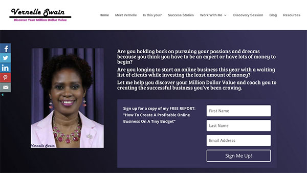
Vernelle Swain, a student of the course did exactly that on her website a few months ago. And since then, she’s been able to easily tweak and test her website as her niche unfolds.
Here are two keys to doing it …
1. Use your name as your domain name.
Brand you, if your niche isn’t clear. This way you’ll be able to change your content and not have to deal with annoying time-wasting tech headaches of changing your domain name.
2. Make a lean website.
Make a website with the core essentials (easy to use, technically smooth, a powerful message, an invitation for people to take action) so that you quickly and confidently get out there, share your site, attract people and see if you can generate leads. Avoid the time-wasting shiny tech objects that really don’t matter at the start.
Back to Vernelle’s site …

Some finer points on Vernelle’s website
1. We have a core message at the top of her website. One that speaks to her ideal market. Notice she uses wording that is not about “coaching” but is about pains, frustrations, desires, and wishes.
2. Notice that there are invitations to take action. There are two: her email list and her discovery call. This way she will know if people are actually doing something.
3. Notice how prominent the calls-to-action are. She doesn’t just hide a “call me for a consultation” on the bottom of the last page of the site. Rather, it’s right in your face.
4. And the key thing – flexibility. If she needs to change her niche, she can easily just change various pockets of content to reflect her new niche. Easily.
5. Even the graphics are simple to change. She can quickly change her logo by swapping in a new one. Her photo can stay the same, or not. The colors can easily be changed with a few clicks.
6. There is not much to do technically, either. She doesn’t have to get a new domain name, set up new hosting, or install new software. Nice!
The take-home message is to build a lean website and use your name as your domain name if your niche has a lot of evolving to do.
This way you can easily tweak it to match and test out your niche.
So, how’s your site? Did you spend forever on it? Did you have to redo one for a change of niche? I’d love to hear your thoughts. Just post below.
