Paul’s Website Tweak to Engage Visitors and Win New Clients
Below is a quick website review for Paul’s Farmer’s coaching website.
For others who want a quick eye on your website, you can post yours (for free) to The Coaches Support Group on LinkedIn. Managed by my home EG Sebastian. Feel free to tell him I sent you for free coffee.
If you want to find the best ways to turn your stuck website into a lead-generating monster, then request an In Depth Expert Website Review Session with me.
Onto Paul’s website …
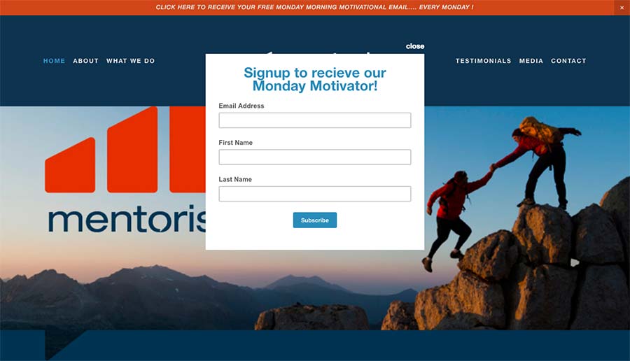
Here’s Paul’s website before screenshot …

I love the colors and the classic mountain climbing image. Dramatic is good.
The site feels professional and clean, with white space. It has good visual curb appeal.
You’ve got nice photo and content throughout the site as well.
Here’s my suggestion to engage visitors and become more referr-able …
While I know you’re a coach, and your site is essentially about helping people in their work/life/career, when I first land, it doesn’t explain that at all.
Consider these:
- When people first land on websites, they need to be able to know what it’s about. If it’s not clear, they’ll likely just leave. That’s called the bounce rate.
- Furthermore, not only does it need to be clear “what your site is about” it also needs to be exciting – so when the right person arrives, they dig into your content eagerly. That oughta happen on first landing as well.
- Further-furthermore, those who visit who are NOT your ideal client (your site isn’t aimed at them, but they are checking you out, like referral partners, colleagues, networkers), those people need to understand your website so they can refer people to it.
As it stands, the only thing I gather from the homepage is “monday motivational” … so this website is something about motivation. That’s a bit vague.
I see you have a few different target clients/offers for individuals, athletes, groups and business.
That’s ok.
Plan A: Focus
What I’d do is figure out which of your client groupings you’re running into (or intend to run into) the most, and tailor a message to speak to them.
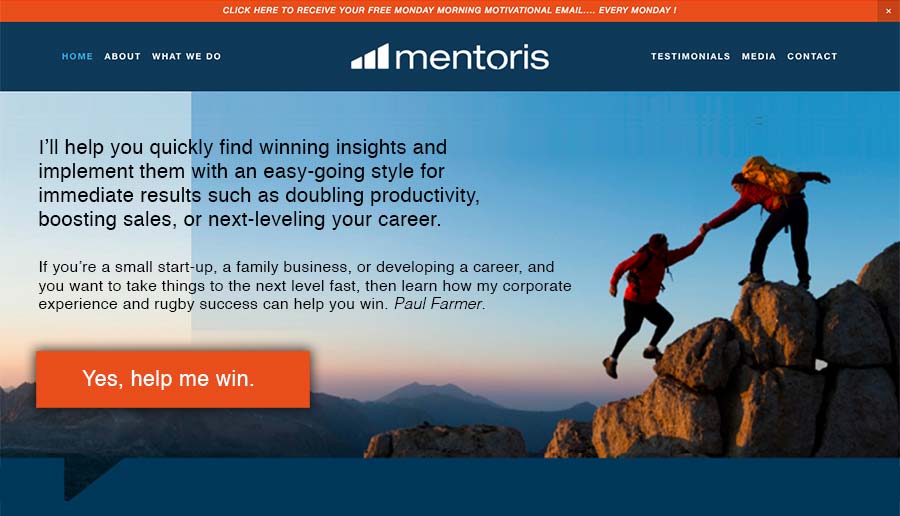
One way to get across a solid, client-focused message that’s engaging, is to slap in a headline (or tagline on the home page, above the fold, in clear, immediate view).
Focus and have more impact.
Plan B: List
I know it’s tough to narrow down, and so the next move (no screenshot for this) is to put a short message to target each of your target groups (limiting to 3) at the top of the home page.
Simply pout 3 boxes across with a headline or benefit-driven statement and a link to each. Sort of like the stuff you have lower on your page.
Here’s the after screenshot, showing you what I mean in Plan A …

Paul, if you’ve any questions on this, just post in the comments or shoot me a private message. I’d be happy to clarify.
More help …
To further your site along, I’d get your face up on the site sooner and take ownership as “the face of your business” and even consider a title like “winning coach” to leverage your rugby experience.
Oddly, you’ll probably find that the people you attract are sporty, those that like a challenge.
From there, I’d look at things like creating more compelling calls to action, especially on your opt-in offer (spell out more value).
Then, track numbers such as traffic, actions taken, pages viewed, new leads. Track actions as well such as outreach strategies to drive the traffic. You know that in sports, all the talent, creative effort, team strategy comes down to numbers … the higher scoring team wins.
In The Coaching Site Guide, in one diagram of many, I put 11 ways to immediate highlight value on your homepage, to show get visitors eager to read your website and see why you’re a great coach to work with.
For a full 10-point, professional website review, with the goal at making your website a client-attracting machine, you may want to book some quality time with me.

