Killer Photo Shots to Get for Your Coaching Website
Online, it’s all about perception.
When someone is considering whether or not to follow you, listen to you, or reach out to you for support, how you present yourself makes all the difference.
Bad photos of you — fuzzy, dated, with beer in hand, or poorly dressed — won’t help them think of you as the coach who will help make big things happen.
Oddly, many coaches don’t even have a single photo of themselves at all, claiming:
- I want to protect my identity
- I don’t like how I look
- My website isn’t about me, it’s about the client
- I don’t have time or money to get one
If there’s no pic at all, potential clients will wonder if you’re too lazy to get one and conclude that you’re not serious about your business.
I understand that you may have personal reasons for no photo — but remember that these people (possible clients!) are forming an opinion of you, and everything matters.
Here are three kinds of photo shots I suggest you get to build that real, credible, professional image that clients like …
Photo Shot #1. A Great Headshot
This one is from the shoulders up, where you’re looking at the camera, with a warm, welcoming, approachable smile.
KENN TIP! Take a photo much bigger than your head and shoulders so that your designer can crop it tastefully.
A professional headshot is the most important of the three because it’ll be used all over the web — on your website, on social profiles, on a podcast, with your articles — anywhere and everywhere.


KENN TIP! I love photos out in nature. They bring a healthy glow, a liveliness to your shots. Try to be in the shade or go for cloudy day to avoid odd shadows or squinty eyes.
I typically use these photos on blog posts, in signature areas, and in direct messages like on a “thank you for subscribing” page.
Here’s an article on how to get a great headshot.
Photo Shot #2. An Action Shot
An image of you “in action” is great because it helps clients see themselves working with you.
For example, you sitting and coaching someone, or you giving a presentation in front of a group.
In this image below, Shirley is giving a talk to businesswomen. Her standing in front of a room gives tremendous credibility.

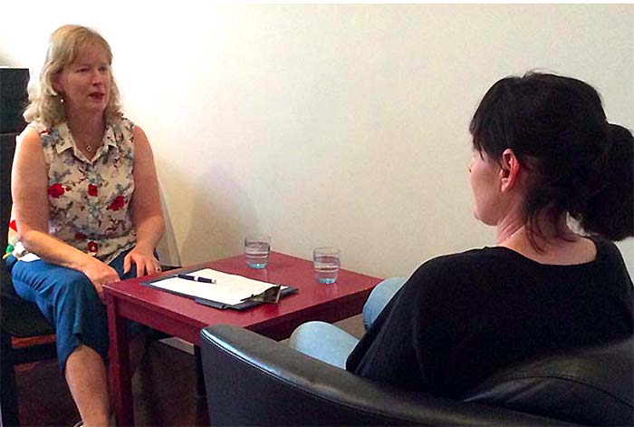
Below, Susan is coaching a parent of a child with ADHD. Though it’s a simple picture, it’s 100% real — and clients love that.
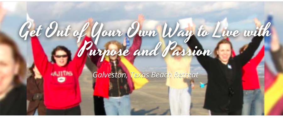
Below, Katherine is dancing across the beach with her workshop attendees. I bet you wish you were there. 😉
Action shots are great for the top of the homepage or on a service/coaching/program page.
They make great social posts too.
“Don’t just tell them what you do — show it!”
Photo Shot #3. A Reality Shot
The deeper you connect with your audience, the better. A picture of you in real life, doing something you enjoy (family-friendly please) gives another dimension to who you are.
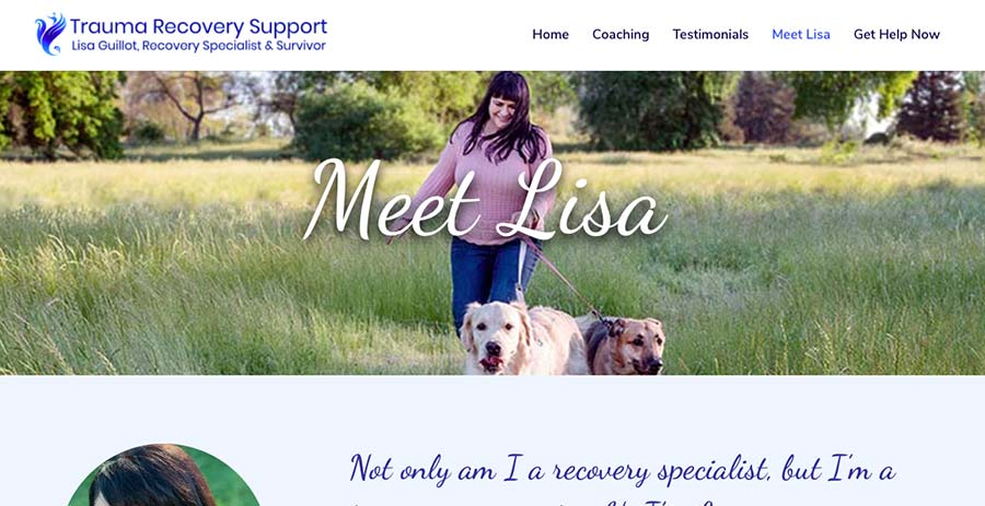
Here’s a big landscape image of trauma coach Lisa walking her dogs in nature. Pets are magical for healing and recovery and you can bet her clients will be drawn to this image.
Rachel is a career/executive coach. This is a great outdoor shot of her, fully equipped with a warm smile.
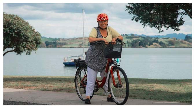
And last but not least, yours truly at the beach, getting creative, and fully taking advantage of natural light. The top-view shot is a fun angle too.
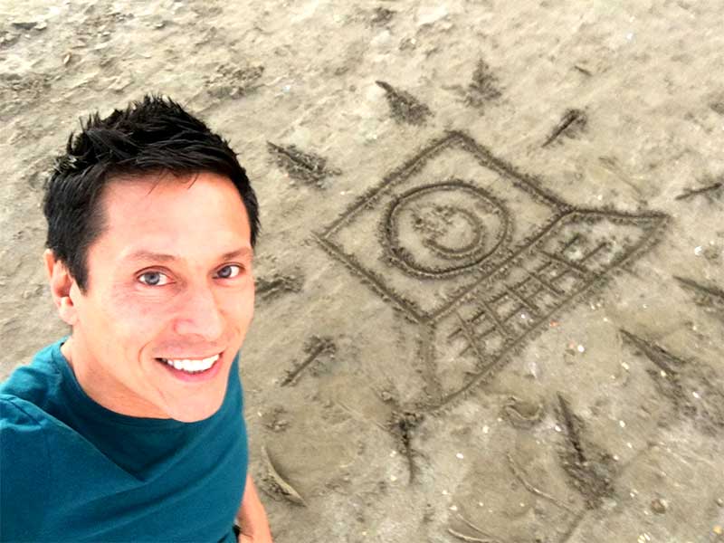
A reality shot is perfect for your About Me page, and really grab attention on social posts.
KENN TIP! Be sure to take a big picture, wider than the scene because your designer will like need to crop it for the specific communication (social post, web page, event cover image, etc).
The key to super photo shots for your coaching website is …
Remember that potential clients are checking you out online.
They want a coach who they can connect with, feel good about, like, and trust.
Take the time to get great shots using the tips above.
BIG ASK! You know I love hearing from coaches around the world in the heat of growing their businesses. Hit LIKE or make a comment and let me know that I’m reaching you. Thanks!

Great post Ken. I agree you need a good photo that is relevant to expressing who you are and what you do. Only drawback I see is that a photo can sometime be judged on the persons appearance – (book and cover) so it is so important to get it right and not just put up any old selfie.