Have Em at Hello – Site Tweak for William
William Rapp (his website is here) has a nice site and below is a suggestion with before-and-after images to quickly direct visitors to content that will make them be like, “Wow! This is the coach for me!”
If you want to improve your website, then schedule some quality time with me here.
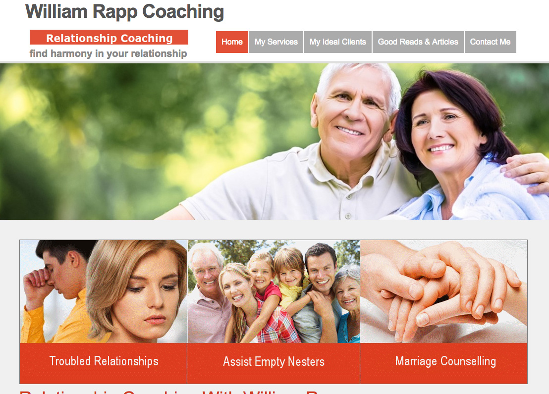
Before screenshot …

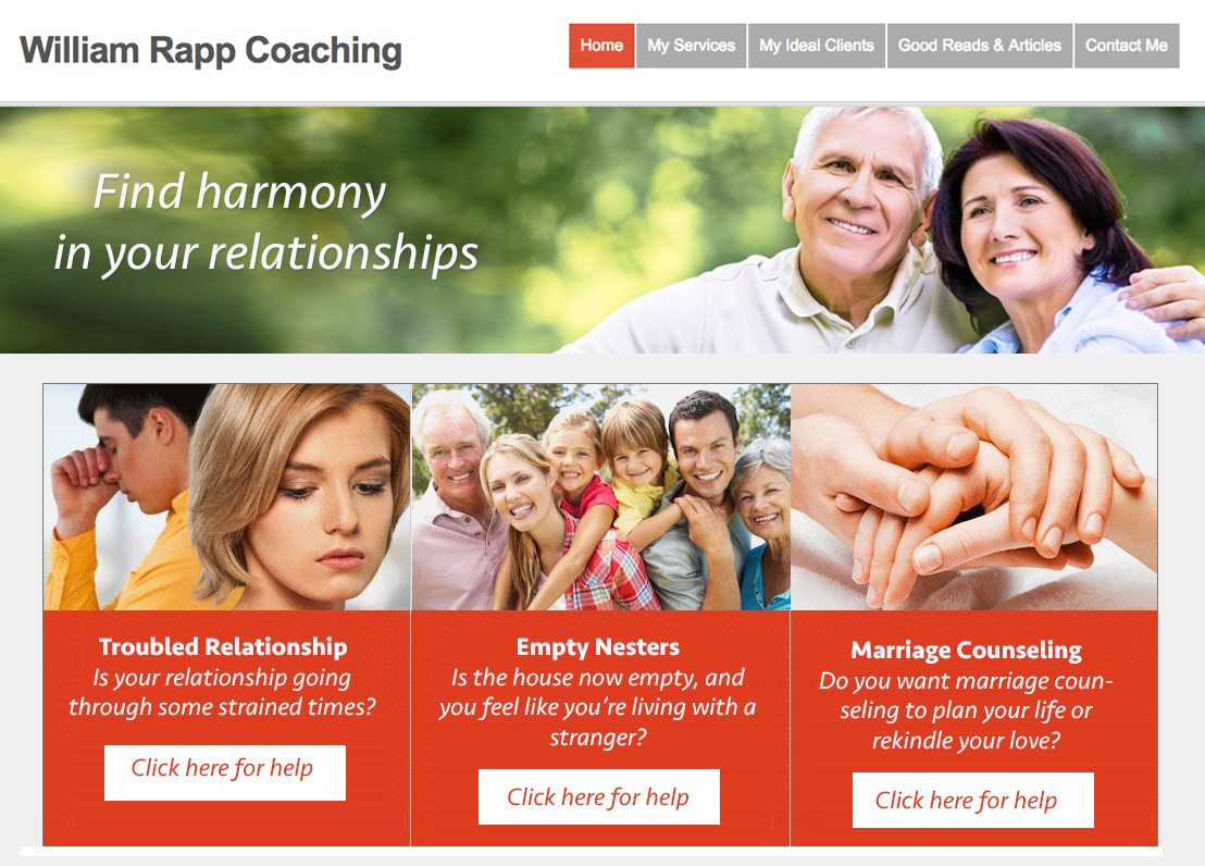
To improve it, I would …
Visually, I like the white and red-orange as it gives it a fresh feel, and a bit of warm fun. Nice.
Also, you have some great images there. Nice too.
Since you’ve identified key things people seek in those 3 boxes on the home page, I would make links from those to special pages about those specific interests.
Meet them where they are at and lead them to a page dedicated to that topic – and then to contact you for coaching.
After screenshot …

What do you think? I’d love to hear from you. Just comment below.
[fblike]


Thanks Kenn. Let me look at this and come back to you. I like the idea of having different pages for the headings.
Will review and come back to you.
William
Great … the idea, and the overall move to make, is to meet people where they are at, and the hard parts (pains) are what we will work to resolve. Overall, liked your site. I’d be curious about conversions / traffic and how your strategy sessions are going so you can be full with clients all the time.