Tweak Your Website for Client Attraction on LinkedIn
If you want me to review your coaching website, schedule some quality time with me here and we’ll find high-impact yet easy-to-do enhancements to improve your website for client attraction.
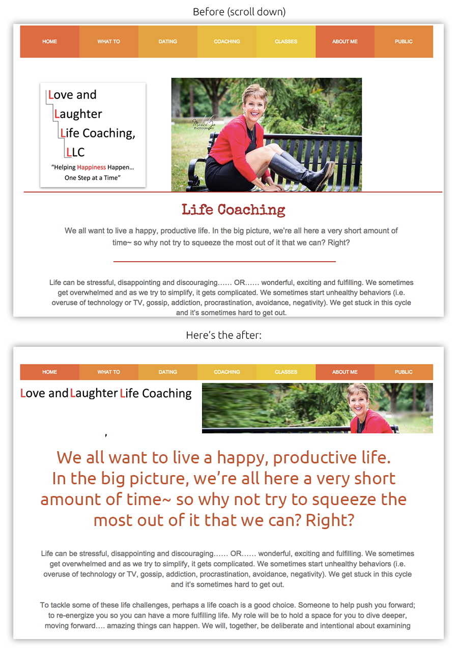
Below is a before and after visual for Elizabeth’s website.

And my tweak is …
I like your energy and smile in your photo. (That is you right? Remove marci and put your name instead, people easily get confused). But, yeah, good vibe in your photo – that’s a big plus online.
Coaches (myself included) when they first start out, love their logo and want everyone to see it, so they make it big on the site. And it ends up taking up quite a bit of space and moves precious content that clients really care about down on the page, “below the fold”. This is not ideal as you want to grab attention right when people land.
I’d shrink your logo and instead put this big, front, and center, “We all want to live a happy, productive life. In the big picture … “.
If you want to build your client base, say to 10 ongoing steady clients paying your full rate, then you’ll want your message to be loud and clear. One of the diagrams in The Coaching Site Guide shows 11 things that get your message across “above the fold” – that prime space people see once they land on your site and before they scroll. Learn more about the guide here.
What do you think? Got ideas to improve the page? Love to hear from you, just post below.
